Teledyne Vision Solutions
One website for six business units, on one design system.

- Role
- Web Product Designer, Digital Experience team
- Timeline
- November 2021 – April 2024, two and a half years.
- Year
- 2021 — 2024
- Pages in the shared website
- 2,000+
- Business units on one system
- 6
- Articles migrated
- 500+
- Tools
- Figma · Google Analytics · Hotjar · A/B testing +1
- Type
- Enterprise website · Design system · Content migration
- Client
- Teledyne Vision Solutions
- Role
- Web Product Designer
- Deliverables
- Design system, IA, migration
- Timeline
- Nov 2021 – Apr 2024
- Scale
- 2,000+ pages, six units
One website of more than 2,000 pages, on one design system, for six of Teledyne’s imaging business units.
00 · TL;DR
The thirty-second version.
Six lines on Teledyne Vision Solutions. The chapters below show the work behind each one.
- Role
- Web Product Designer on Teledyne’s Digital Experience team: design system, information architecture, content migration.
- Team
- The Digital Experience team across marketing, content and development; six business units as stakeholders; an outsourced migration team that I managed.
- Timeline
- November 2021 – April 2024, two and a half years.
- Scope
- UX and content for a twelve-site portfolio with 1M+ visitors a year, and a 2,000+ page website for six business units.
- What I decided
- One navigation and one set of Figma parts for every unit. A Learn hub sorted by topic, not by org chart. Migration run as a reviewed pipeline, not a copy job.
- Outcome
- A 2,000+ page site supporting six business units, with 500+ articles migrated. A team delivery: these figures describe the project, not personal results, and test uplift stays with Teledyne.

Teledyne Vision Solutions sells cameras, sensors and imaging systems to engineers and scientists. Behind that one name sat six business units, each with its own website, catalogue and habits.
Chapter 01 of 12
Overview
The job was to bring them into one site of more than 2,000 pages without losing what each unit’s buyers came for.
I was a Web Product Designer on Teledyne’s Digital Experience team from November 2021 to April 2024. Alongside this site I looked after UX and content across the wider web portfolio: twelve websites, more than a million visitors a year.


Chapter 02 of 12
My role
The site was a team delivery. These are the parts I carried.
Looked after a twelve-site portfolio.
UX and content across twelve Teledyne websites with more than a million visitors a year, alongside the new site.
Led UX and content strategy for the new site.
The UX and web content strategy for a website of more than 2,000 pages, spanning six business units.
Helped standardise the design system.
I contributed to one Figma design system across business units, so each part is built once: less development time, a more consistent brand.
Ran the content migration.
I managed an outsourced team through the migration of more than 500 articles, set the guidance and reviewed their work in cycles, then trained the people who would publish after launch.
The problem
Chapter 03 of 12
Same buyer, several different websites
Before the project, Teledyne Vision Solutions lived on several websites, each with its own branding and design. A buyer moving from one unit’s cameras to another’s met a different layout, a different menu and a different way of reading a spec.
Each unit also paid, separately, to build and maintain pages that did the same job.
- Teledyne
- 2021 – 2024
- Web product design
The people
Chapter 04 of 12
Who the site is for

The technical buyer
 Engineer, scientist, integrator or buyer
 Often arrives from search, deep in the site
The people on the other end are technical: machine-vision engineers, lab scientists, system integrators, procurement. They arrive with a part number or a requirement and want to compare, check a spec and ask for a quote. Anything that slows that down costs a sale, not just a click.
What got in the way
- A different layout on each unit’s site.
- A different menu, and a different way of reading a spec.
- Crossing from one unit’s cameras to another’s meant relearning the site.
What they came to do
- Compare products.
- Check a spec.
- Ask for a quote.
How the new site helps
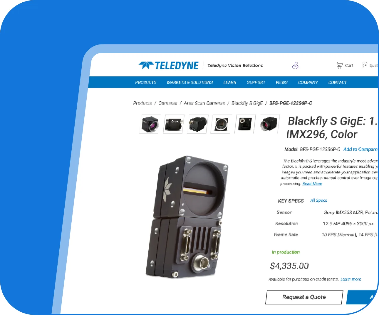
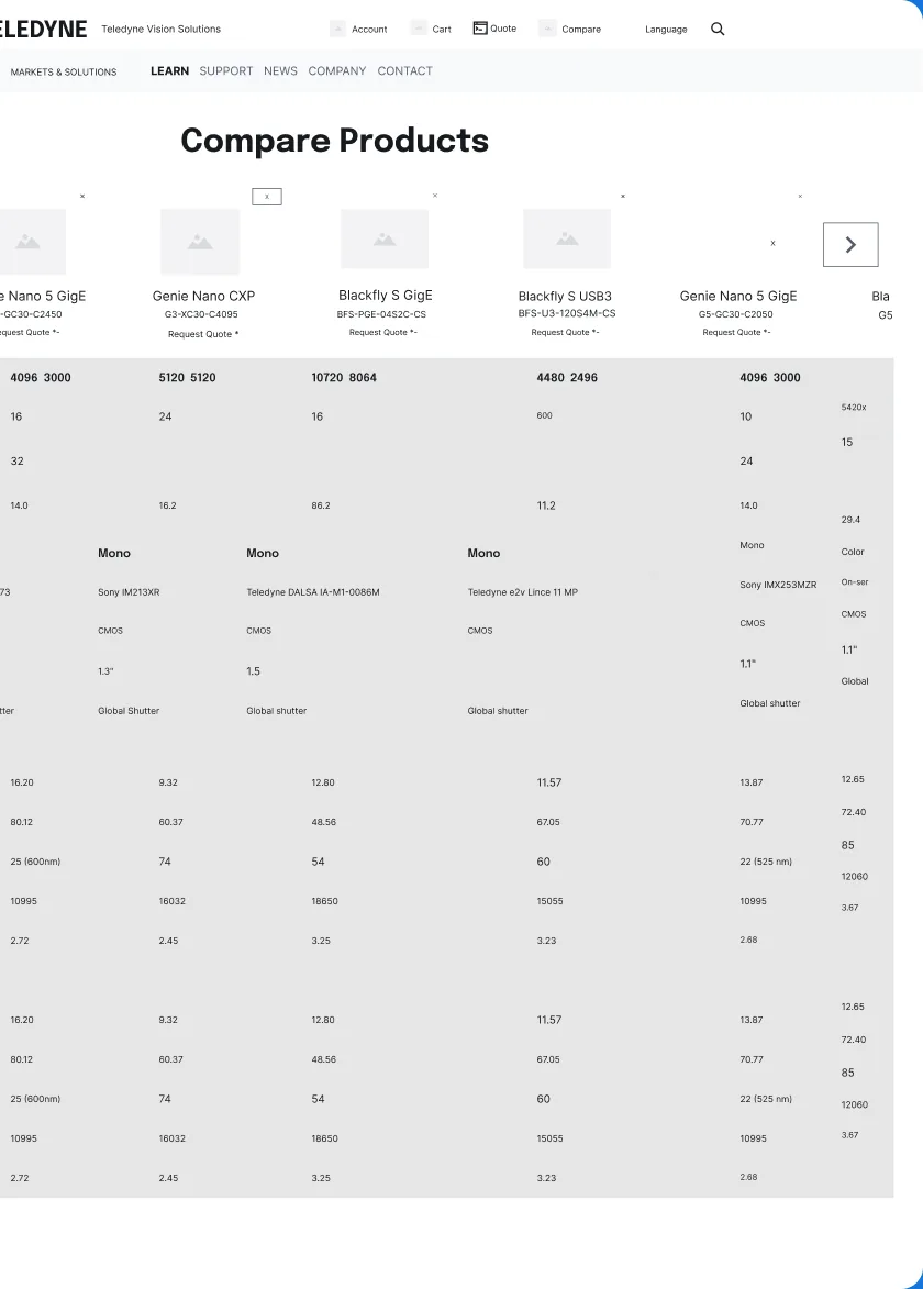
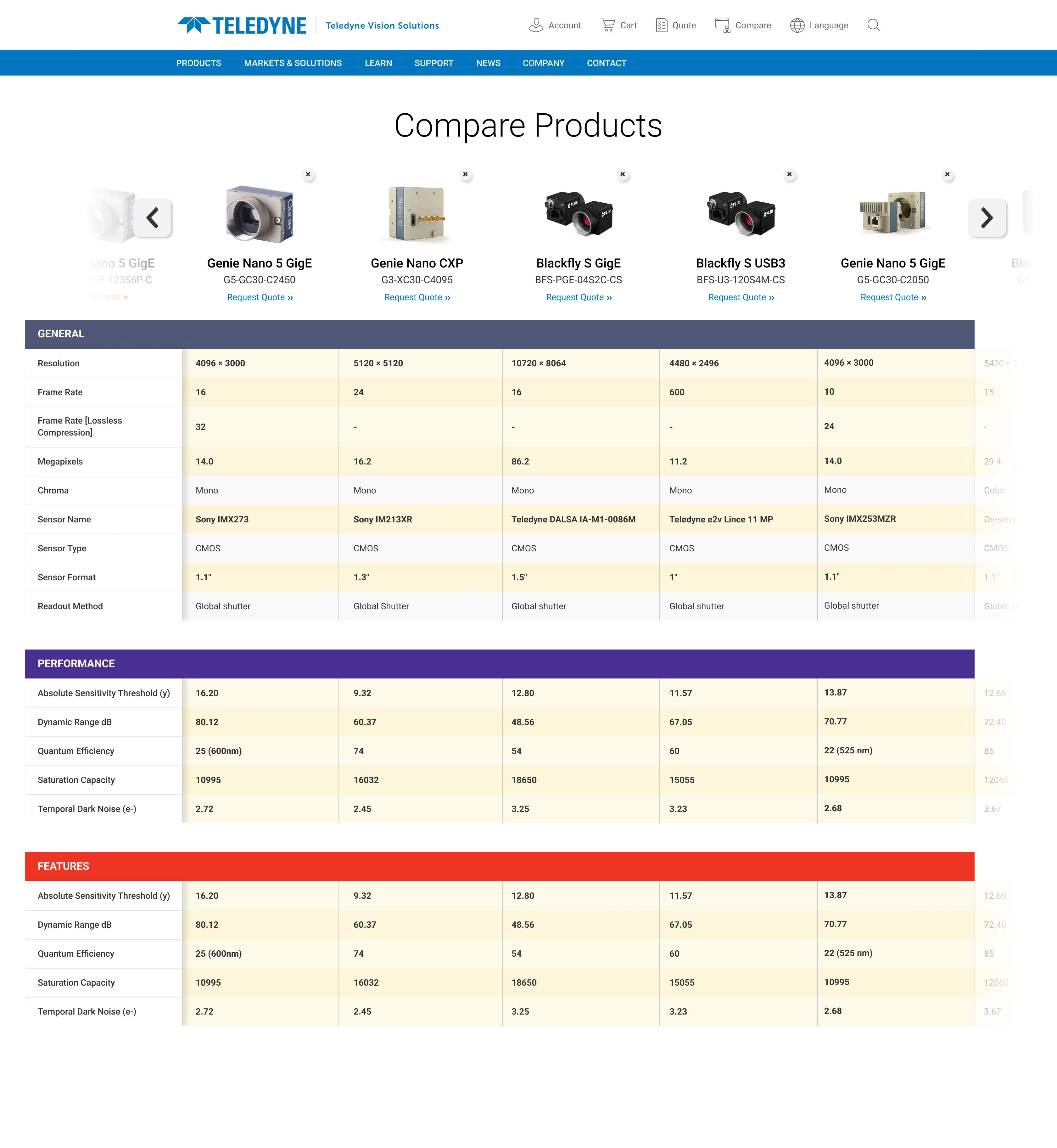
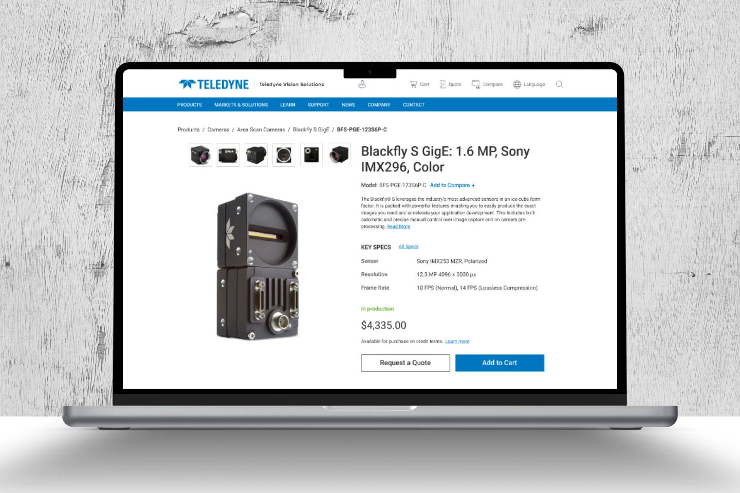
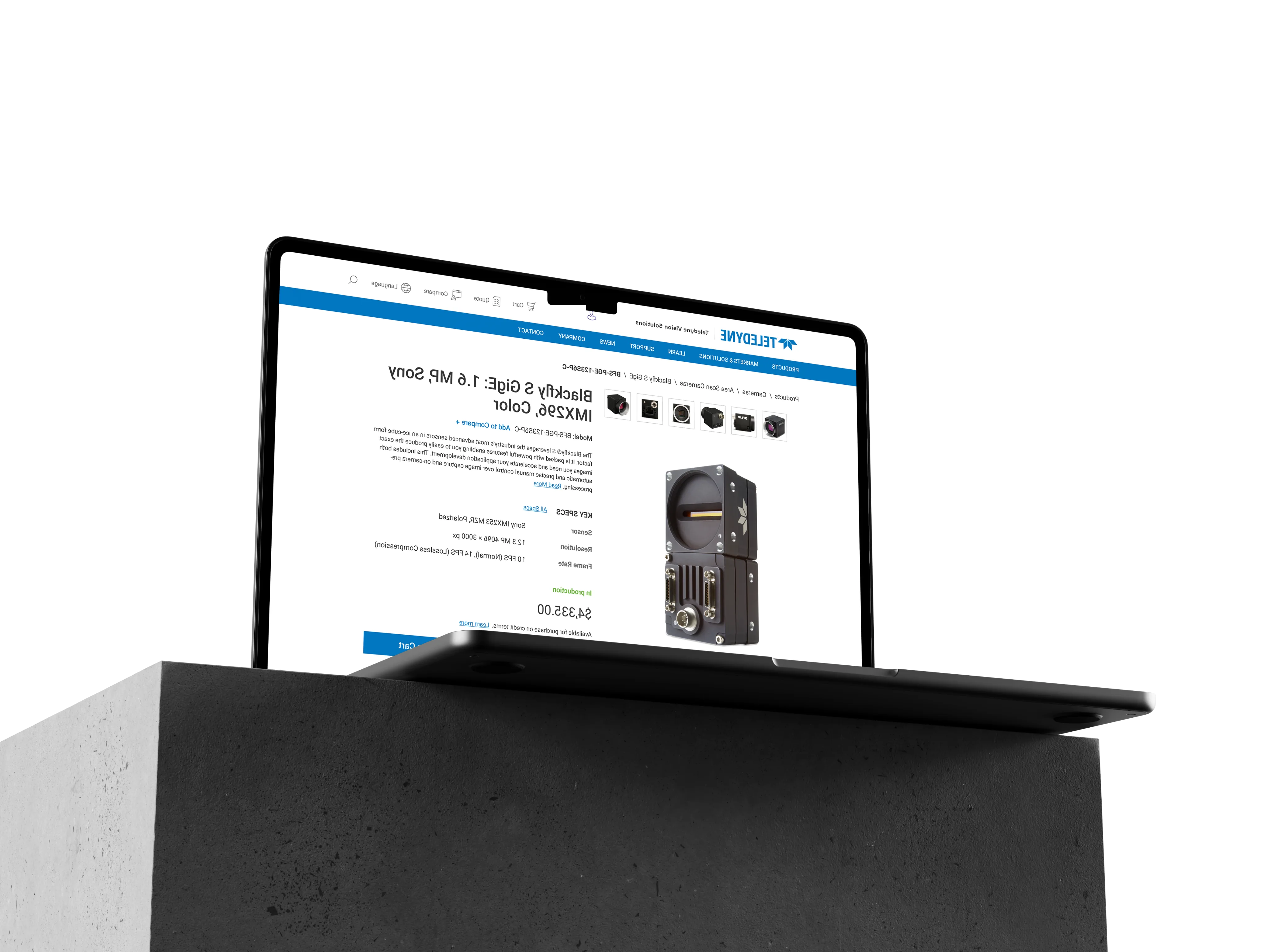
Specs sit in a table, so sensor, resolution and frame rate line up and two cameras compare at a glance. A breadcrumb on every product tells someone arriving from search where they are. Request a Quote and Compare sit in the same place on every product, because a technical purchase is rarely one click.
Chapter 05 of 12
What we had to work within
Every decision on the site had to fit inside these.
Six business units
Each with its own product lines, priorities and sign-off.
More than 2,000 pages
And 500+ thought-leadership articles that had to move without breaking.
- 01An outsourced migration
- An outsourced team did much of the migration; I set its guidance and reviewed its work.
- 02Authors, not web editors
- The people publishing after launch were scientists and product managers, not web editors.
- 03A shared development team
- Every design had to be built once and reused, or it would not be built at all.

Chapter 06 of 12
Decisions, and what they cost
Three decisions shaped the site. Each one asked the business units to give something up.
Decision 01
One navigation for every unit
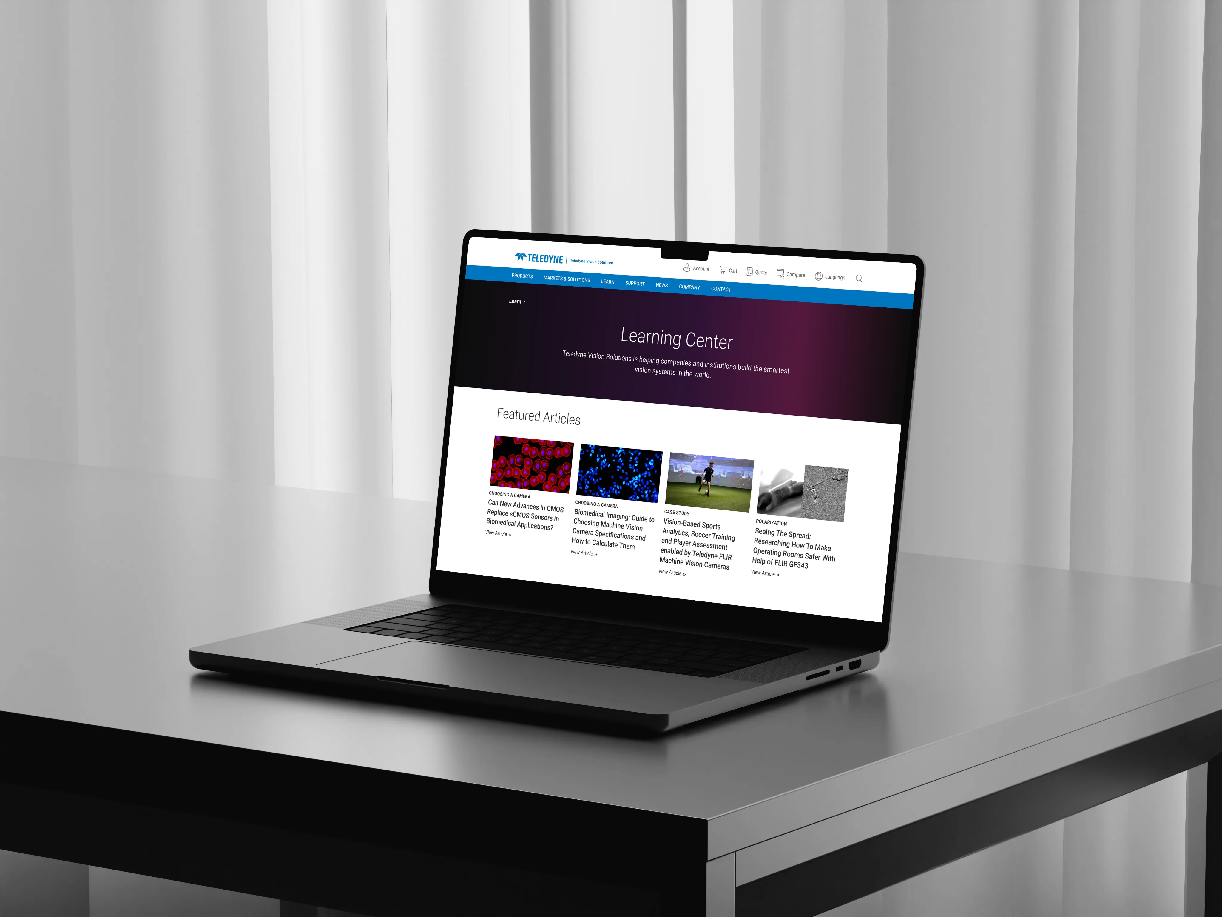
Products, Markets & Solutions, Learn, Support, News, Company, Contact: the same seven doors on every page.
In return, a buyer who crosses from one unit to another never has to relearn the site.
The trade-off
Units gave up their own menus.
Decision 02
Sort learning by topic, not by org chart
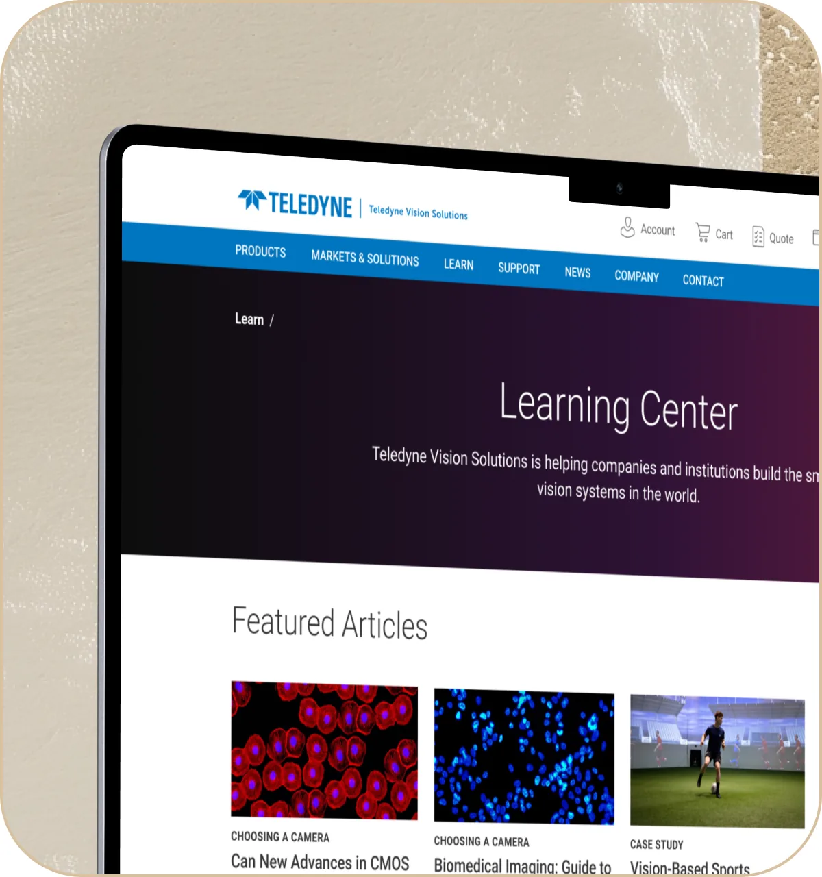
The Learn hub groups articles by what the reader studies and by type. Which unit wrote an article stops mattering.
The trade-off
The cost was discipline: every migrated article needed a topic and a type before it could go live.
Decision 03
Standardise parts, not pages
One header, one breadcrumb, one product page and one article card in Figma that every unit fills, instead of unit-by-unit pages.
The page count kept growing; the number of things to maintain did not.
The trade-off
Some unit-specific layouts were cut.

Chapter 07 of 12
Before and after, for that buyer
Arrives with
- A part number.
- A requirement: sensor, resolution, frame rate.
- Two or three cameras to compare.
Met before
- A different layout on each unit’s site.
- A different menu on each.
- A different way of reading a spec.
Wants to
- Compare cameras side by side.
- Check a spec without reading a paragraph.
- Ask for a quote.
Meets now
- The same seven doors on every page.
- Specs in a table.
- Request a Quote and Compare in the same place on every product.
Information architecture
Chapter 08 of 12
Seven doors on every page
Products, Markets & Solutions, Learn, Support, News, Company and Contact on every page, with Account, Cart, Quote, Compare and Language in the utility bar.




Teledyne Vision Solutions
- Products
- Cameras
- Model Finder
- Info Cards
- Product Categories
- Camera Selection Tool
- Featured Use and Application
- Related Articles
- Cameras
- Learn
- Featured Articles
- Topics
- Industrial Imaging and Machine Vision
- Scientific Imaging
- Quote
- Selected Products
- Submit Inquiry
- Selected Products
- Compare
- Compare Products
- Add
- Remove
- Compare Products
- Search
- Account
- Cart
- Language
- Markets and Solutions
- Support
- News
- Company
- Contact
Wireframes
Chapter 09 of 12
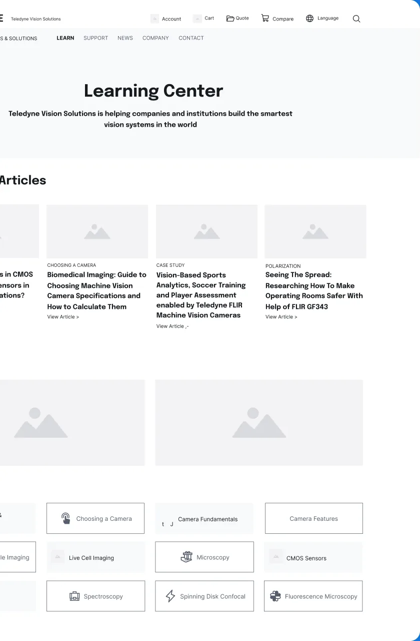
Grey boxes first
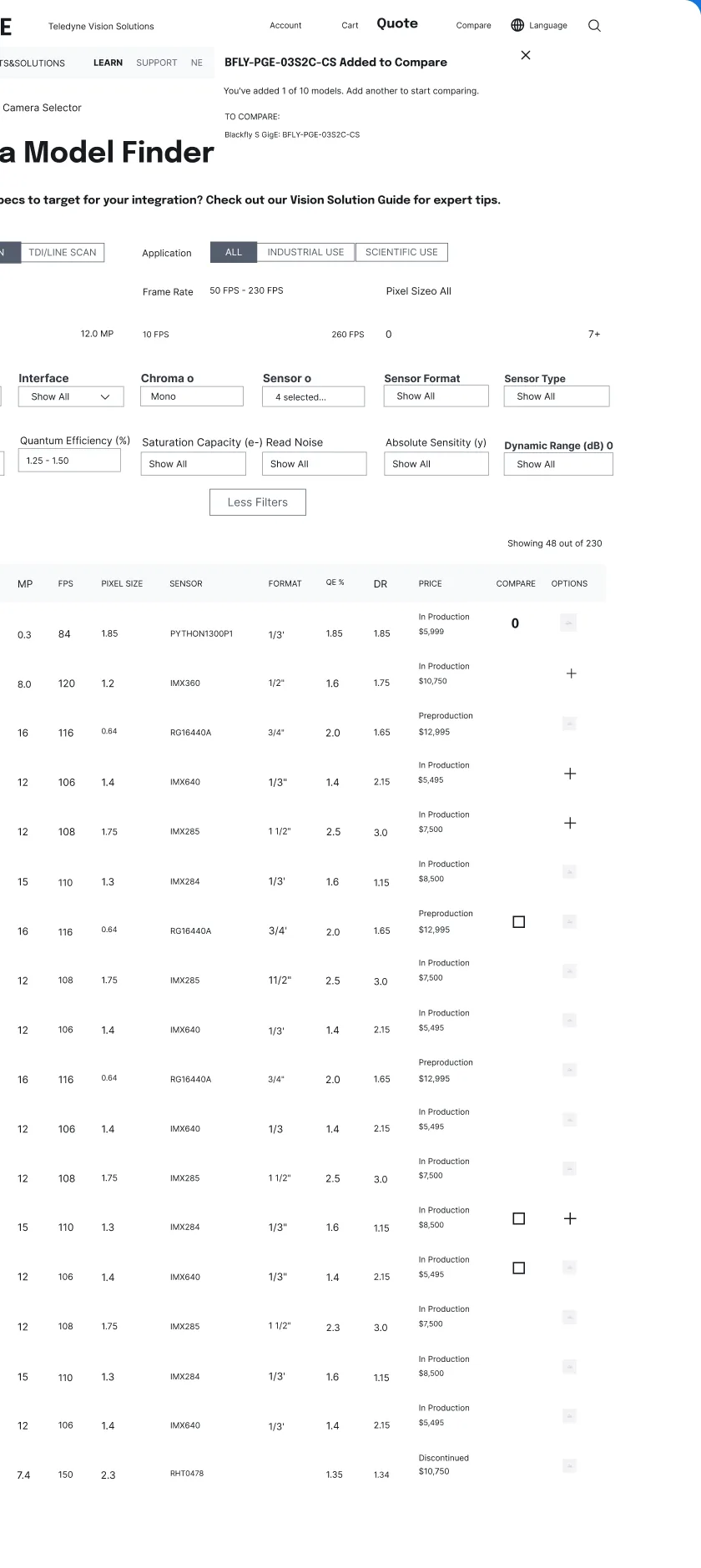
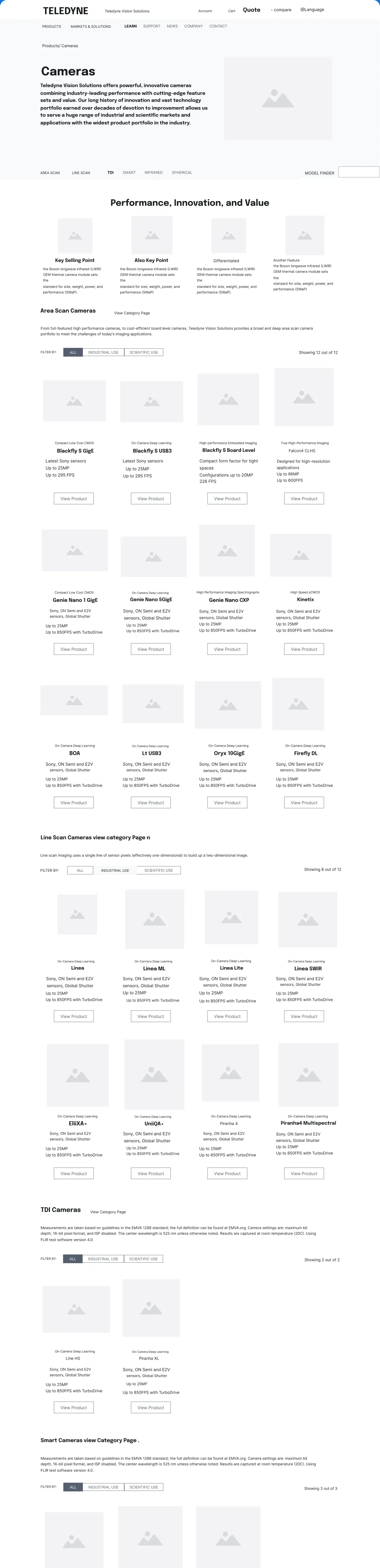
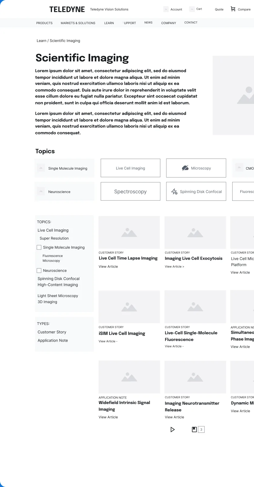
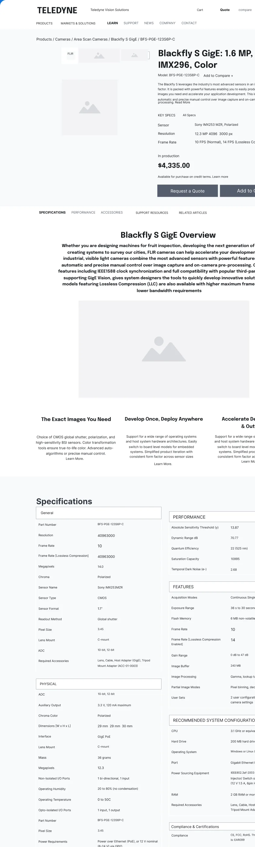
The Learn hub, a camera category, a topic page, compare, the model finder and the product page, laid out in grey before any visual design.
Style guide
Chapter 10 of 12
One palette, one type family
- French Blue#0076C0Pure White#FFFFFF
- Pure Black#000000Dusk#4F5877Apple Green#6CB33F
- Boston Blue#3784C6Mercury#E5E5E5Dove Grey#666666
- Dune#333333ZodiacGradientWineGradient
Design system
Chapter 11 of 12
A shared system in Figma
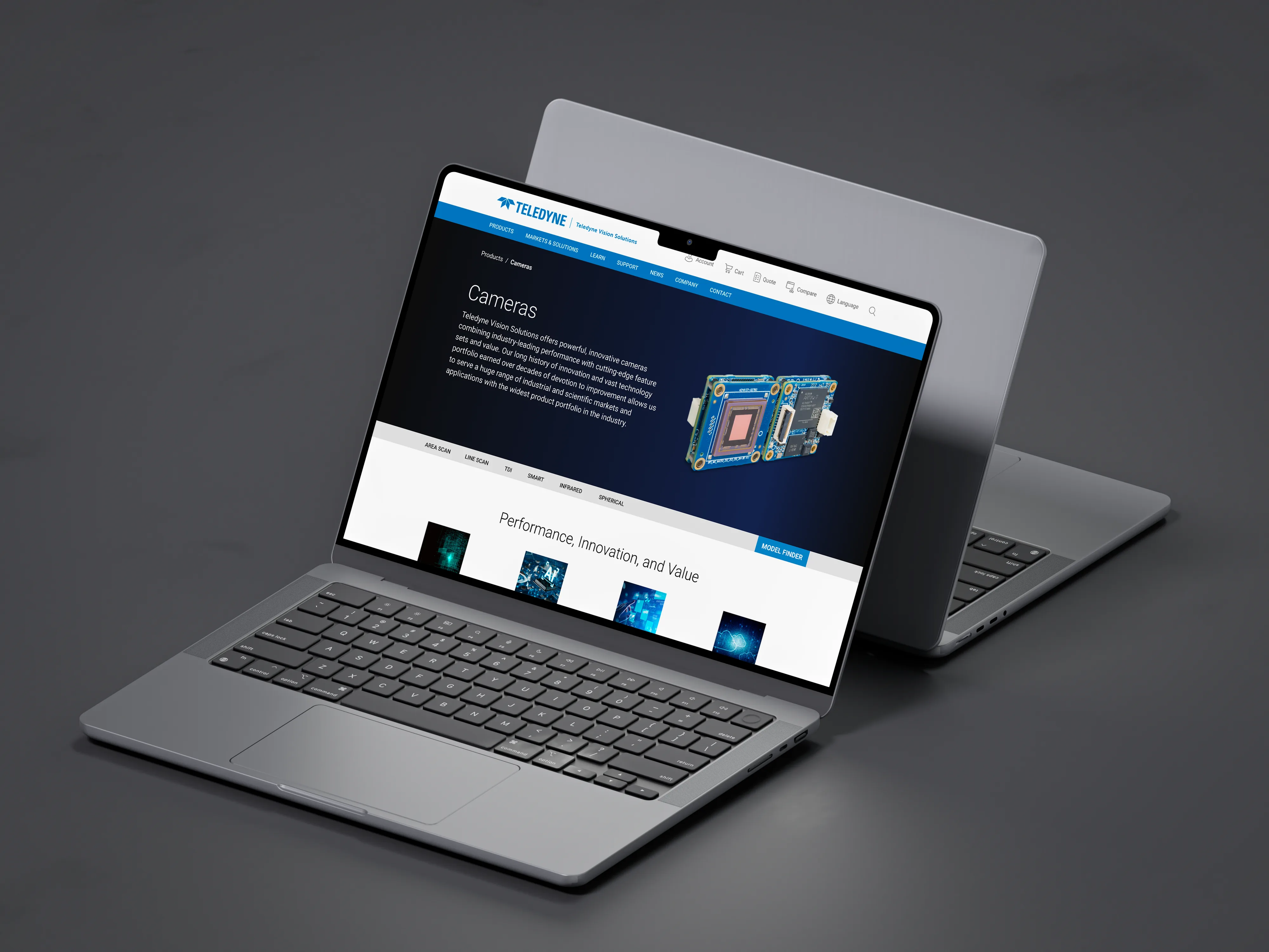
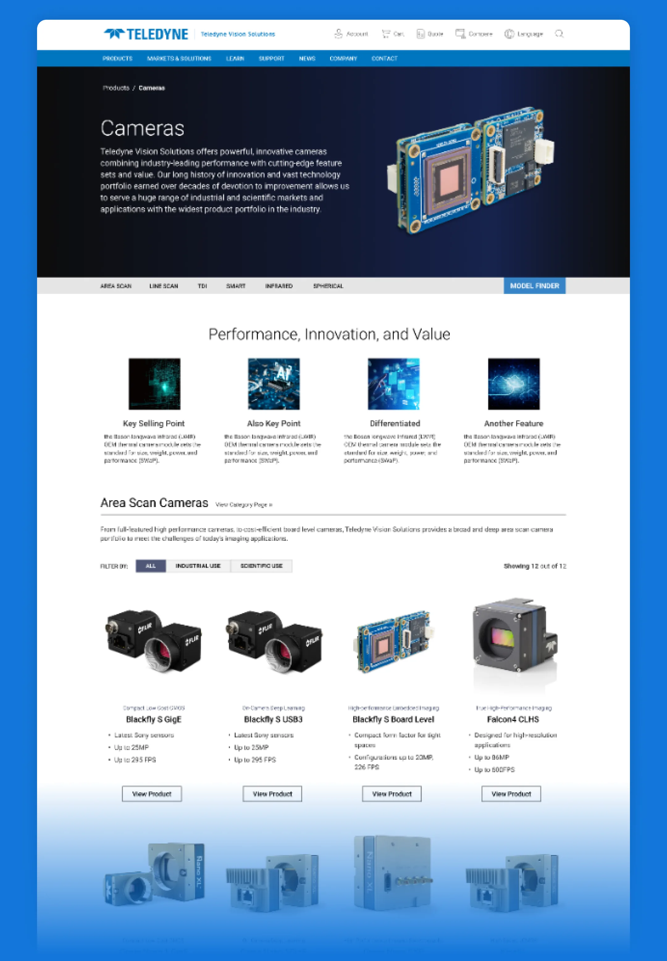
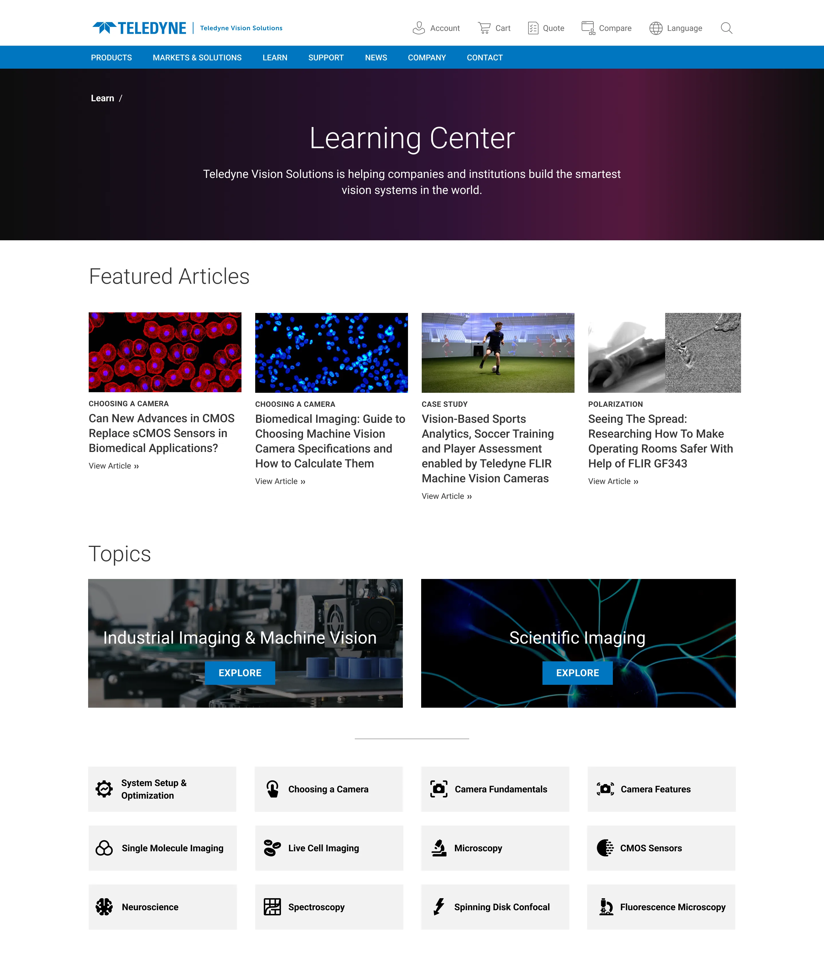
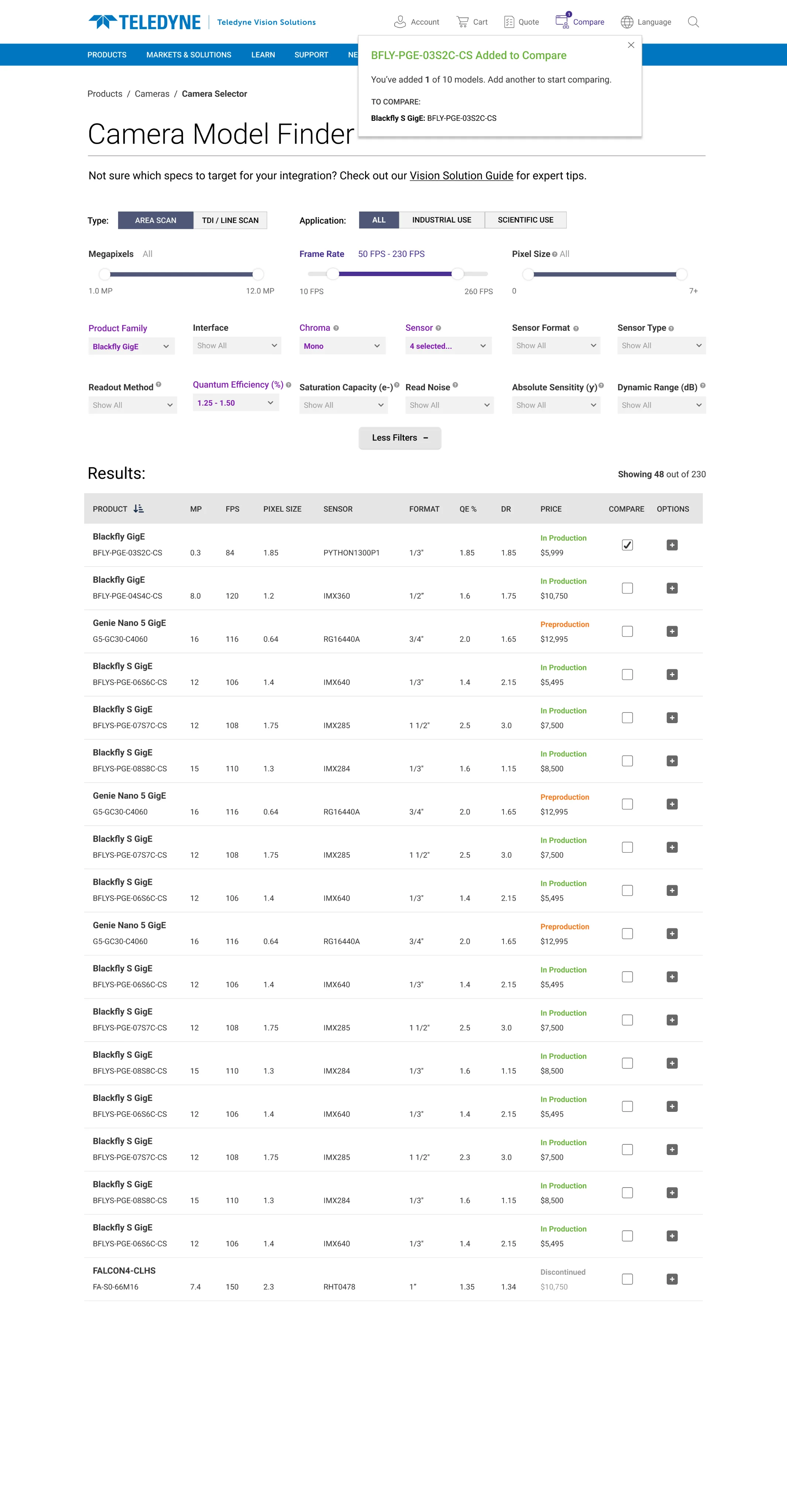
I contributed to a unified design system in Figma that spans several Teledyne business units: the global header and navigation, breadcrumbs, the product page with its key-spec table and Request a Quote, category tabs for camera families, topic tiles and article cards. The goal was one visual presentation across units, and lower development cost because each part is built once.

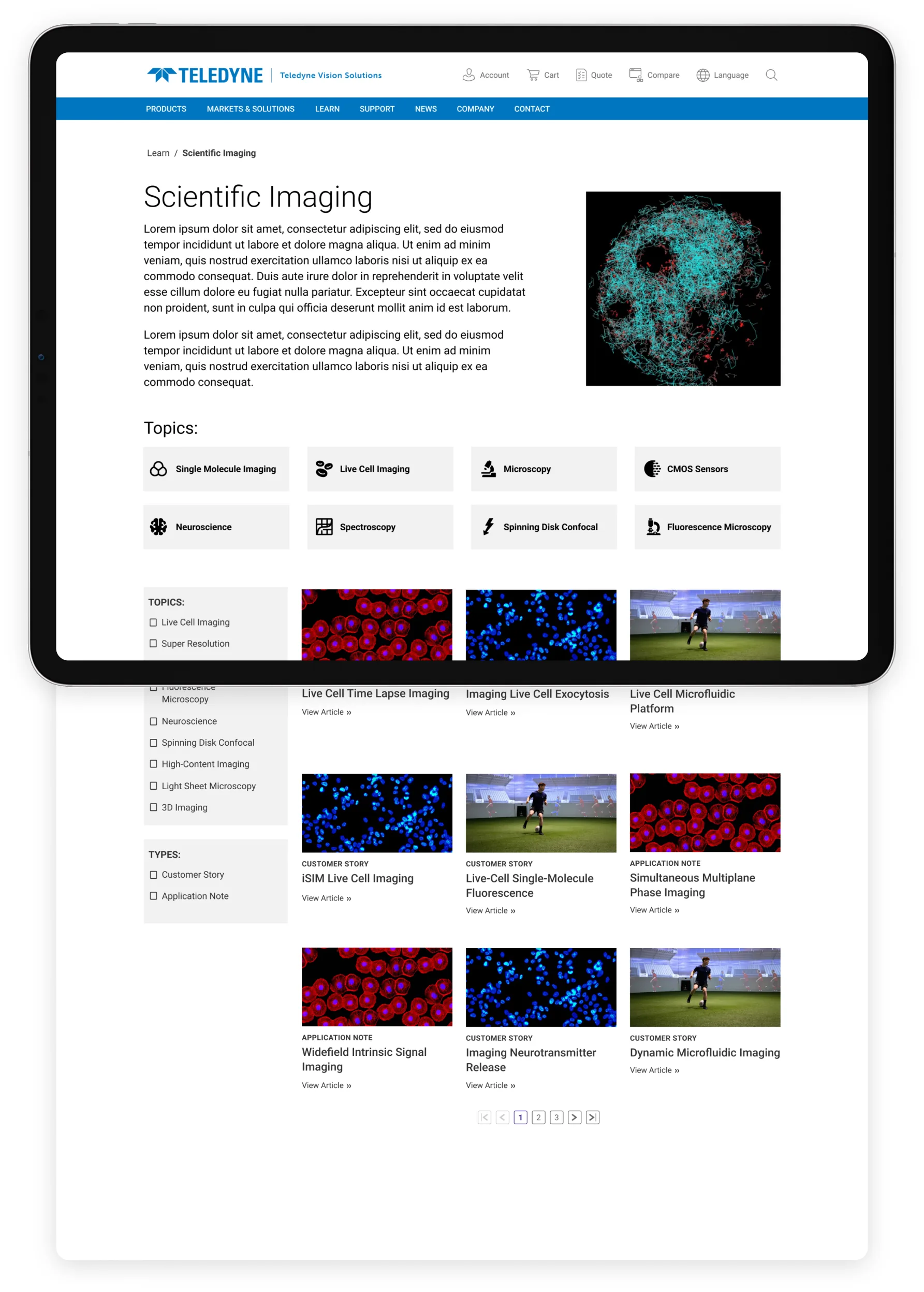
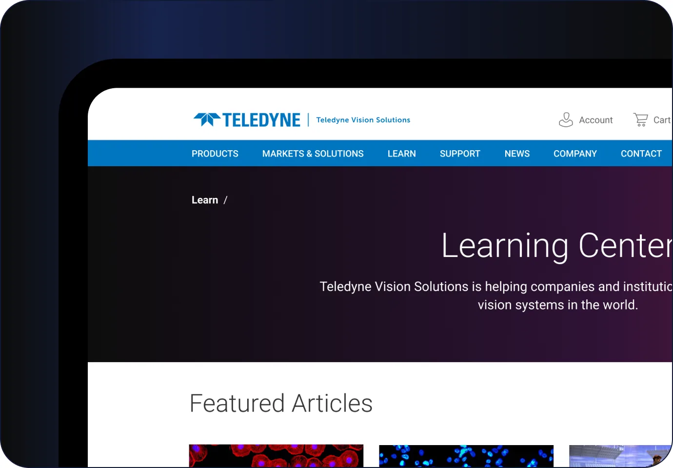
The Learn hub groups articles by what the reader studies (live-cell imaging, spectroscopy, CMOS sensors) and by type, such as customer story or application note.
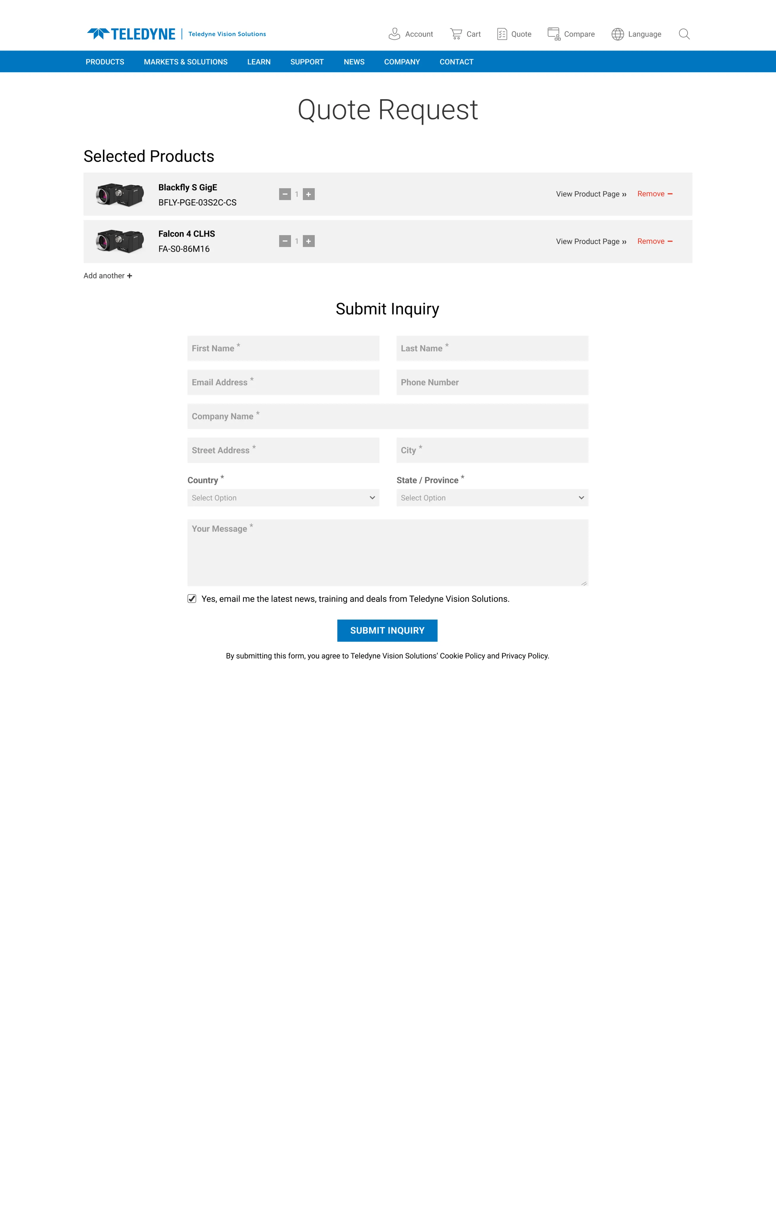

Support works the same way: knowledge-base articles filtered by topic and type, beside software, documentation and contact.

Chapter 12 of 12
What shipped: a website of more than 2,000 pages supporting six business units, on one design system, with more than 500 articles migrated into a topic-led Learn hub.
- Pages in the shared website
- 2,000+
- Business units on one system
- 6
- Articles migrated
- 500+
- Visitors a year across twelve sites
- 1M+
A team delivery: these figures describe the project, not personal results.
Testing what we assumed
We did not treat the new navigation as finished at launch. User testing, analytics, Hotjar heatmaps and A/B tests showed where people hesitated, and we refined navigation, user flows and interface details from what they showed.
What I’d do differently
I would put the content model in front of the business units before the visual design. Who owns a topic, and what counts as an application note, are content questions — cheaper to settle on a whiteboard than in the middle of a migration.
And I would capture a stronger baseline on the old sites before switching them off, so the effect of the new navigation could be measured rather than only observed.
“His oversight, expertise, and attention to detail saw him managing more than 300 articles in a review cycle where he had only a short period of time. He nailed it.”
“He brought skill, creativity and above all immense positive energy to his role designing and developing web and multimedia content. He learned quickly, adapted easily, and was relentless in pursuing progress.”

What shipped
- A 2,000+ page website for six business units, delivered by the Digital Experience team.
- One Figma design system across units: header, navigation, product page, article cards.
- A Learn hub organised by topic and type, not by business unit.
- An outsourced migration of 500+ articles, which I managed and reviewed.