Vritti
A calm way for Canada’s self-employed to set tax aside.
An independent project: an iPhone app for self-employed Canadians. It works out the tax share of every payment, by province, and keeps it visibly set aside in a Tax Jar; an AI helper, Ask Vritti, explains and refers but never decides. And its website, vritti.app, with 16 free tax tools. Designed and directed by me, built with AI coding agents; the app is in TestFlight and not yet live.
 Live Activity
 HomeTax JarActivityInvoices
 Ask Vritti
 InsightsFinancial AcademyChallengesYou
 Widgets
- Role
- Designed and built by me
- Timeline
- First commit 25 March 2026. About seven months to a submission-ready build.
- Year
- 2026
- Status
In TestFlight · not yet live
vritti.app (opens in a new tab)
- Tools
- Figma · Expo · React Native · Supabase +4
- Type
- Fintech · iOS app · AI assistant · Website
Set aside, don’t budget.
Set aside, don’t budget. Every tax number is labelled as an estimate and shows its method. Ask Vritti explains and refers; it never decides. The money never leaves the user’s own account. One jar, one number, one sentence on Home.
00 · TL;DR
The thirty-second version.
Six lines on Vritti. The chapters below show the work behind each one.
- Role
- Independent project, designed and built by me. I set the direction, designed the product, its AI behaviour and its brand, and directed the build. The code was written by AI coding agents working to my briefs and reviews.
- Team
- Me, plus AI agents: Claude for design, build and review; OpenAI Codex as an independent reviewer; an image model for the ceramic objects. No other people.
- Timeline
- First commit 25 March 2026. About seven months to a submission-ready build.
- Scope
- An iPhone app that works out the tax share of every payment a self-employed Canadian receives, by province, and keeps it visibly set aside in a Tax Jar. Bookkeeping, invoices with GST/HST, home-screen widgets, a Live Activity and an AI helper, Ask Vritti, sit around that core. An Android build has run but has not shipped. And its website, vritti.app, with 16 free tax tools.
- What I decided
- Set aside, don’t budget. Every tax number is labelled as an estimate and shows its method. Ask Vritti explains and refers; it never decides. The money never leaves the user’s own account. One jar, one number, one sentence on Home.
- Outcome
- In TestFlight: builds 100 and 101 were uploaded on 27 October 2026. Not live on the App Store yet, so no usage numbers.
Chapter 01 of 10 · The problem
Nobody withholds your tax. The CRA still wants its share.
In Canada, if you work for yourself, nobody withholds your tax. You get paid in full, and in April, or in quarterly instalments, the CRA asks for its share. Many people spend money that was never theirs and find out months later.
The tools don’t fit this moment. Accounting software is built for bookkeepers. Budgeting apps want you to plan every category. Intuit’s QuickBooks Self-Employed, which many freelancers used for exactly this, was discontinued.

A $4,800 payment, and its first slice moving into the jar. Recorded on the TestFlight build with demo data.
Chapter 02 of 10 · The people
Three kinds of earner, one moment of getting paid.
I designed for three kinds of earner. They match the business types an earlier TestFlight build asked about during setup.
01
Freelancers and consultants
Designers, developers, writers.
A few large invoices a month, often with HST on top. They need to know what each invoice really leaves them.
02
Gig and delivery workers
Uber, DoorDash, Instacart.
Many small deposits and little admin time. They need the set-aside to happen without thinking about it.
03
Creators and online sellers
YouTube, Patreon, Etsy, Shopify.
Lumpy income from platforms. They often cross the $30,000 GST/HST line without noticing.
What they do today: a separate savings account and a guessed percentage, a spreadsheet, or nothing until the bill arrives.
Chapter 03 of 10 · Constraints
Five constraints that shaped every screen.
- 01Tax rules change by province
- Ontario, BC, Alberta and Quebec each give a different answer for the same month. Quebec runs its own provincial tax system. A single national rate would be wrong for most people.
- 02Trust with money
- One wrong number, or one number that looks more certain than it is, spends trust that does not come back.
- 03Not tax advice
- Vritti is not an accountant and cannot behave like one. It can estimate and explain. It cannot tell someone whether to incorporate.
- 04Privacy
- Income is sensitive. The app had to work without a bank connection, keep chats on the phone, and say exactly what leaves the device when the AI is used.
- 05One person
- Everything had to be buildable and maintainable by me and the agents I direct.
The same $5,500 month, four provinces
01 Ontario · $1,702
The number arrives as you drag the slider, with plain words for what it means and a way to see the math.
02 BC · $1,733
Switching province re-prices instantly and names the rate, so the difference is visible, not hidden.
03 Alberta · $1,865
Alberta, Ontario and BC side by side show why a single national rate would mislead people.
04 Quebec · $2,195
Quebec gets its own acknowledgement because it runs a separate provincial tax system.
The same $5,500 month, weighed in a Tax Jar
- Province
- Ontario
- Monthly income
- $5,500
- Set aside
- $1,702
- 30.9% of income
2026 figures from Vritti’s set-aside estimate, as shown in the app; illustrative. The dial reads $1,000 to $2,500 a month.
Chapter 04 of 10 · Key decisions
Six decisions, each with its cost.
Set aside, don’t budget. Every tax number is labelled as an estimate and shows its method. Ask Vritti explains and refers; it never decides. The money never leaves the user’s own account. One jar, one number, one sentence on Home.
[ User flow ]
- Welcome
- Province
- The number
- One payment
- Save it
- Home
- Activity
- Invoices
- Ask Vritti
- Consent
- Answer
// Onboarding · Wireframe
// Home · Wireframe
// Ask Vritti · Wireframe
// Tax Jar · Wireframe
// Activity · Wireframe
// Invoices · Wireframe
D1Set aside
Set aside, don’t budget.
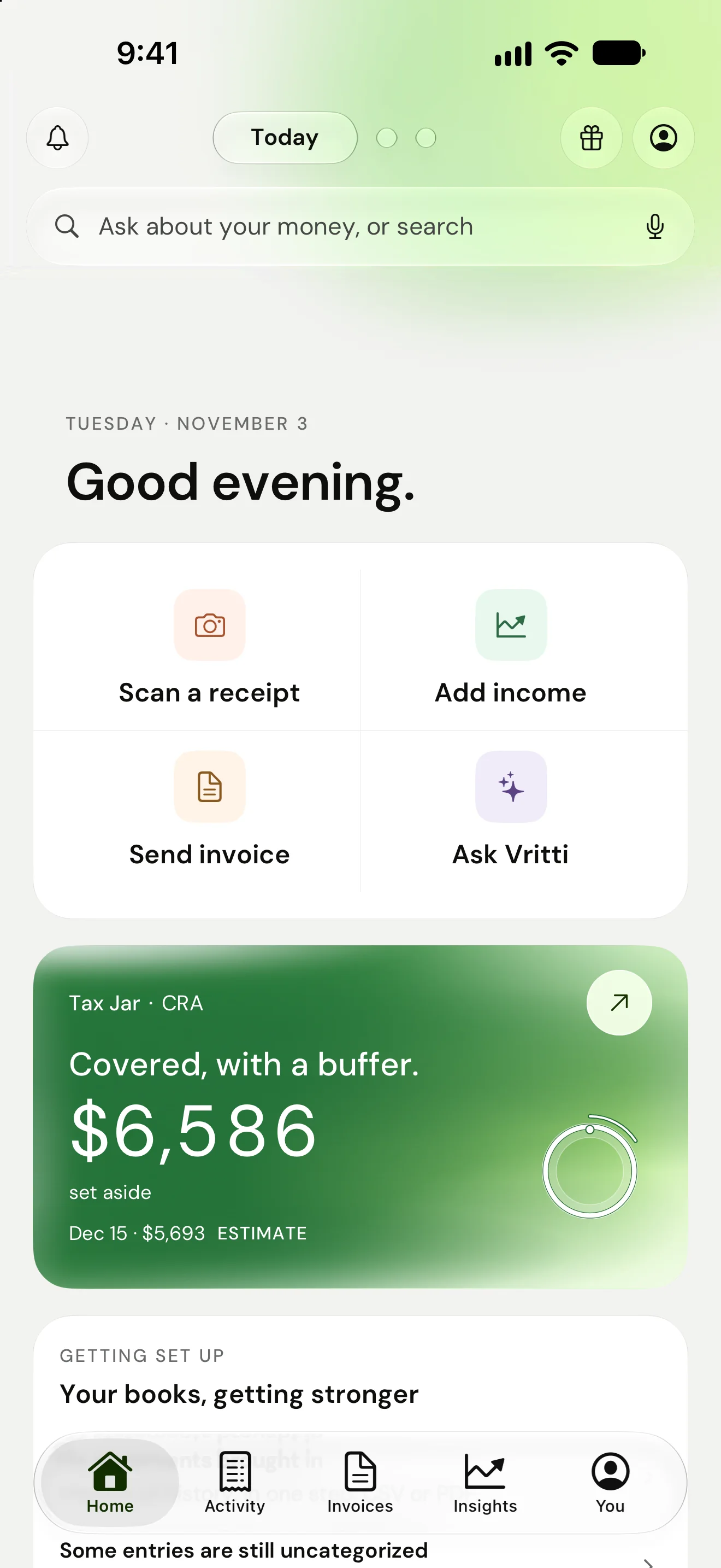
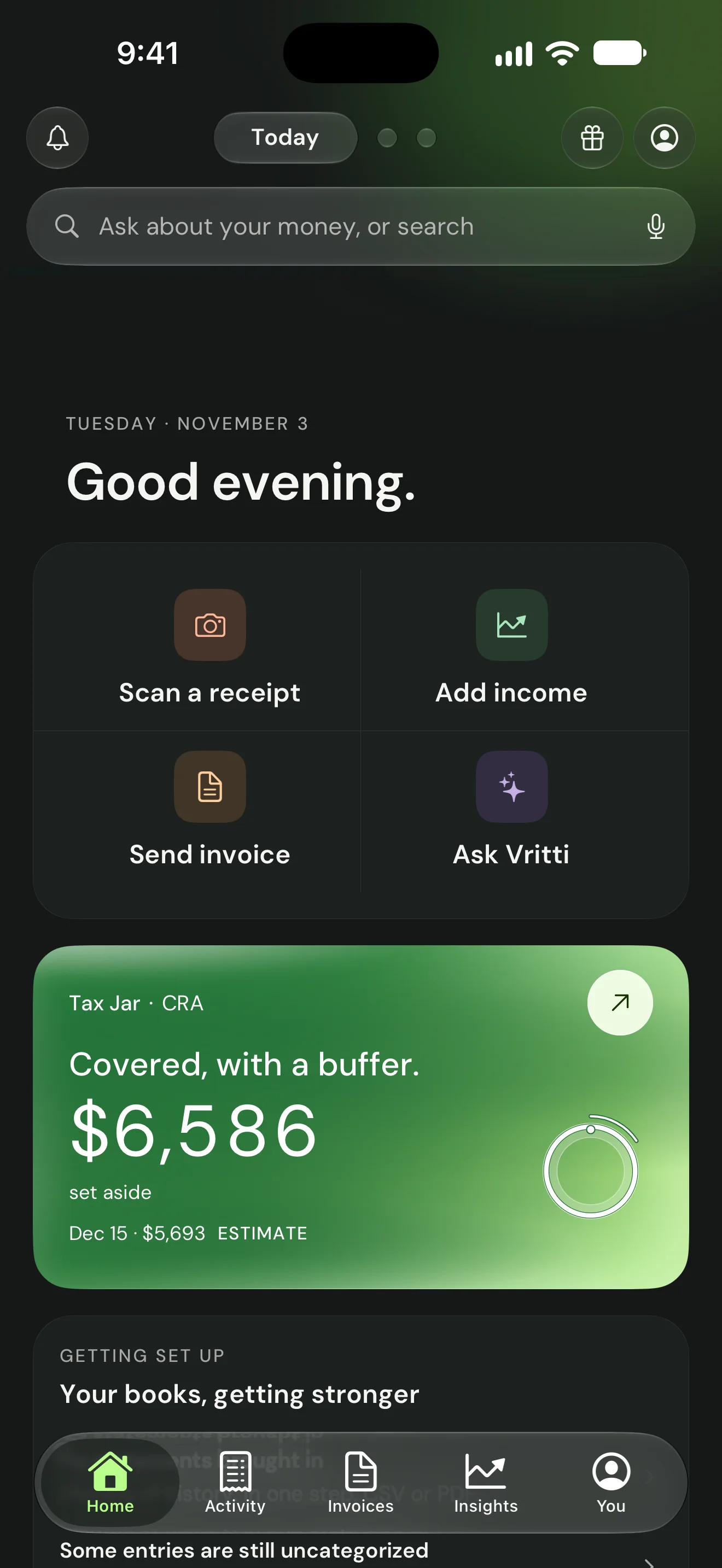
Budgeting asks people to plan their whole life before they get any value. Setting aside asks one thing: when money arrives, how much of it belongs to the CRA? That answer is the whole product’s spine. Home leads with one card: one sentence (“Covered, with a buffer.”), one number and one ring.
The counterweight matters just as much. Every tax number sits next to what is “freely yours” on the Tax Jar, so the app tells you what you can spend, not only what you can’t.
01 Light
Home opens on a greeting and the four daily actions, then one card: a sentence, a number and a ring.
02 Dark
The same card in dark mode, over a dark ground.
- One sentence about the tax
- One number, tagged as an estimate
- One ring that fills
- The next date and what it needs, beside it
The trade-off
People who want full budgeting will find it thin. I kept a P&L, insights and goals, but off Home.
D2First minute
Show the number in the first minute.
The first screen makes one promise: “In about a minute, you’ll see one true number about your own money, before you give us anything.” Four short questions follow, a first name, how money feels lately and whether this is for a business, your own money or both, and each one can be skipped straight to the number.
Then a province and a rough monthly income, and the estimate moves as you drag the slider, before any account. Then one real payment, and the jar shows what happens to it, even when the honest answer is nothing yet. Only then does it ask you to sign up, and the gate carries your number with it.
About you, four questions
01 Welcome
The promise comes before any question: one true number, in about a minute.
02 Promise
The empty jar shows what the minute is for.
03 Name
A first name only, with “I’d rather not, skip” under Continue.
04 Mood
How money feels sets the tone of what follows.
05 Scope
Business, personal or both, side by side.
Your number, then one payment
01 Your number
Province and income on one screen; the estimate moves with the slider.
02 One payment
One amount and a date; nothing else is needed to see the jar work.
03 Honest zero
When the true answer is nothing, the jar says so, and says when that changes.
04 Save it
The gate carries the user’s own number, so signing up feels like keeping something.
01 First launch
From the welcome screen to the sign-up gate, sped up four times.
The trade-off
More anonymous users who never sign up. I accepted that, because a sign-up wall before value is the most common reason finance apps lose people at the door.
D3Uncertainty
Every number is an estimate, and shows its method.
Every tax amount carries an “ESTIMATE” tag in a mono label. The method is always one tap away: “How we got this” under the onboarding number, “How this estimate works” and a line-by-line breakdown (federal, provincial, both halves of CPP) on the Tax Jar. The Home card says “Estimate only. Consult a CPA for your actual tax obligations.” next to the number it qualifies, not in a footer.
01 How we got this
The method sits one tap away from the number, so trust never depends on taking the app’s word for it.
02 Breakdown
Every line of the estimate is named, including both halves of CPP that self-employed people pay.
- ESTIMATE, in a mono labelOn every tax amount, not only the first one.
- Tracked here. Kept in your own account.Where the money is, said under the number.
- What is freely yoursThe counterweight to the tax number.
- Estimate only. Consult a CPA.Next to the number it qualifies, not in a footer.
The trade-off
The screens carry more small text. I kept it to one line per number and pushed detail behind a disclosure.
D4Money stays put
Vritti tracks the jar. It never holds the money.
The Tax Jar screen says “Tracked here. Kept in your own account.” and recommends moving the amount to a separate high-interest account “you only touch for CRA”. Instalments paid outside the app can be marked by hand.
- The money stays in your own account
- Move it somewhere it can’t be spentA separate high-interest account you only touch for CRA.
- Vritti doesn’t move money for youDeliberately. You stay in control of where it sits.
The trade-off
No automatic transfers, which would be a stronger habit. It also means no bank credentials, no money-transmitter rules, and no single point where the app could lose someone’s money.
D5The jar
The jar receded into a ring.
A jar is something you put money into and leave alone. It turns an abstract liability into a container that fills. Early versions used a large photoreal ceramic vase as the hero. In testing it felt like too much on the user’s face, so the object receded.
The jar became a ring that fills, and small matte ceramic objects now appear only in empty states and moments: a bowl on welcome, a padlock for privacy, an envelope for invoices.
01 Home
The empty Home gives one next step and shows the empty ring rather than a zero dashboard.
02 Invoices
Each empty state has its own ceramic object, so empty never looks broken.
03 Insights
With no data yet, Insights offers learning instead of empty charts.
The trade-off
A ring is less distinctive than a vase. The number and the sentence now do the work, which is where the attention should be.
D6Today’s build
The build in TestFlight now: colour, glass, one Home that swipes.
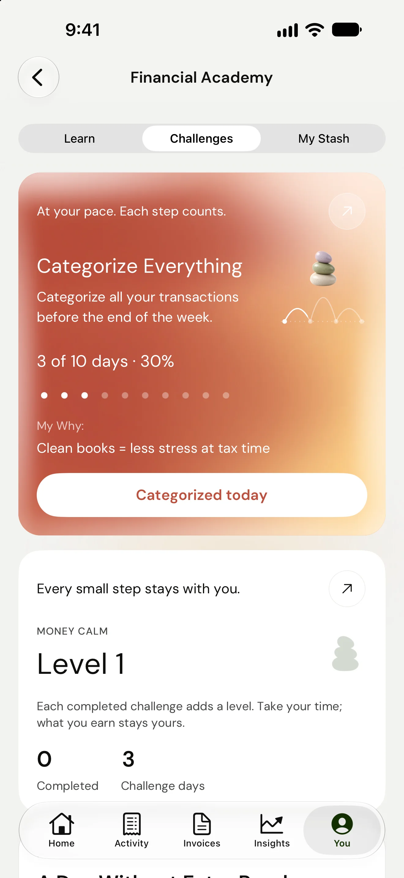
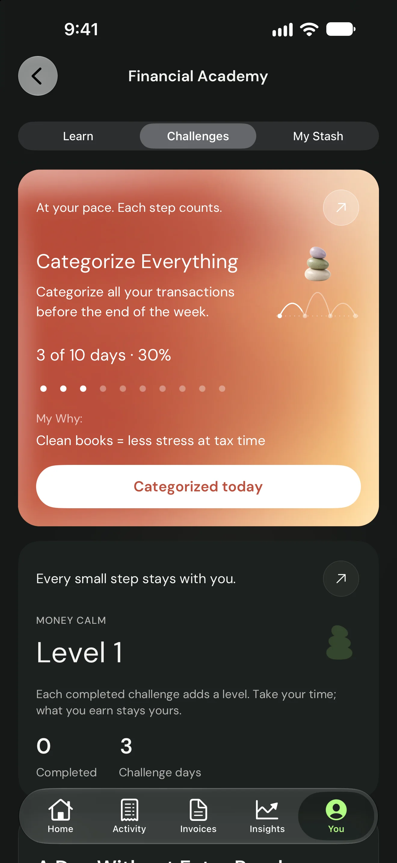
The current TestFlight build keeps the same spine, one sentence, one number and one ring, and changes the surface around it. Home is now three pages you swipe between: Today, Money and Grow. Each page has its own colour, in soft glass cards over a quiet ground.
Today answers the tax question. Money answers what is safe to take, after tax is covered. Grow offers one short lesson and one next step. Challenges, recaps and reports follow the same cards, with sample data throughout.
Home, three pages
01 Today
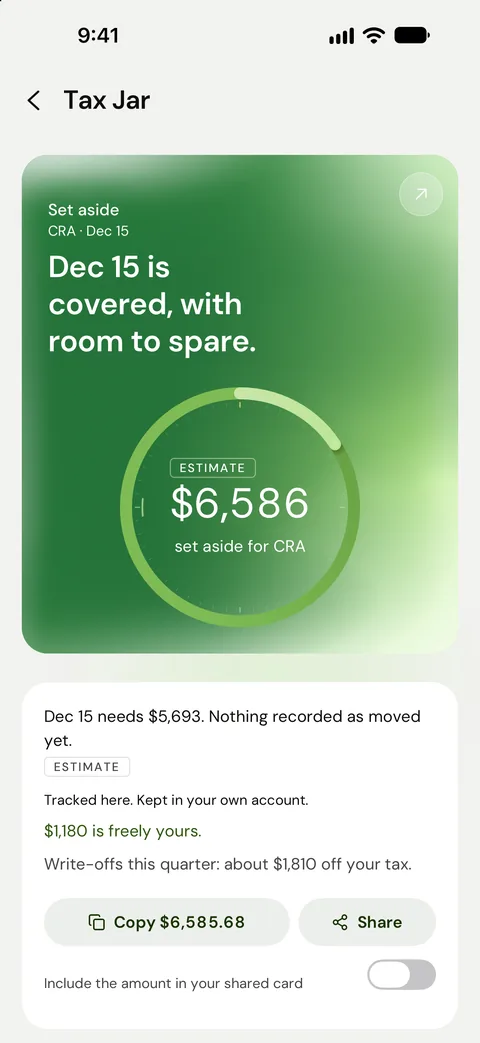
The Tax Jar card leads: covered, with a buffer, and what Dec 15 needs beside it.
02 Money
What you can take this month, worked out after the tax is covered.
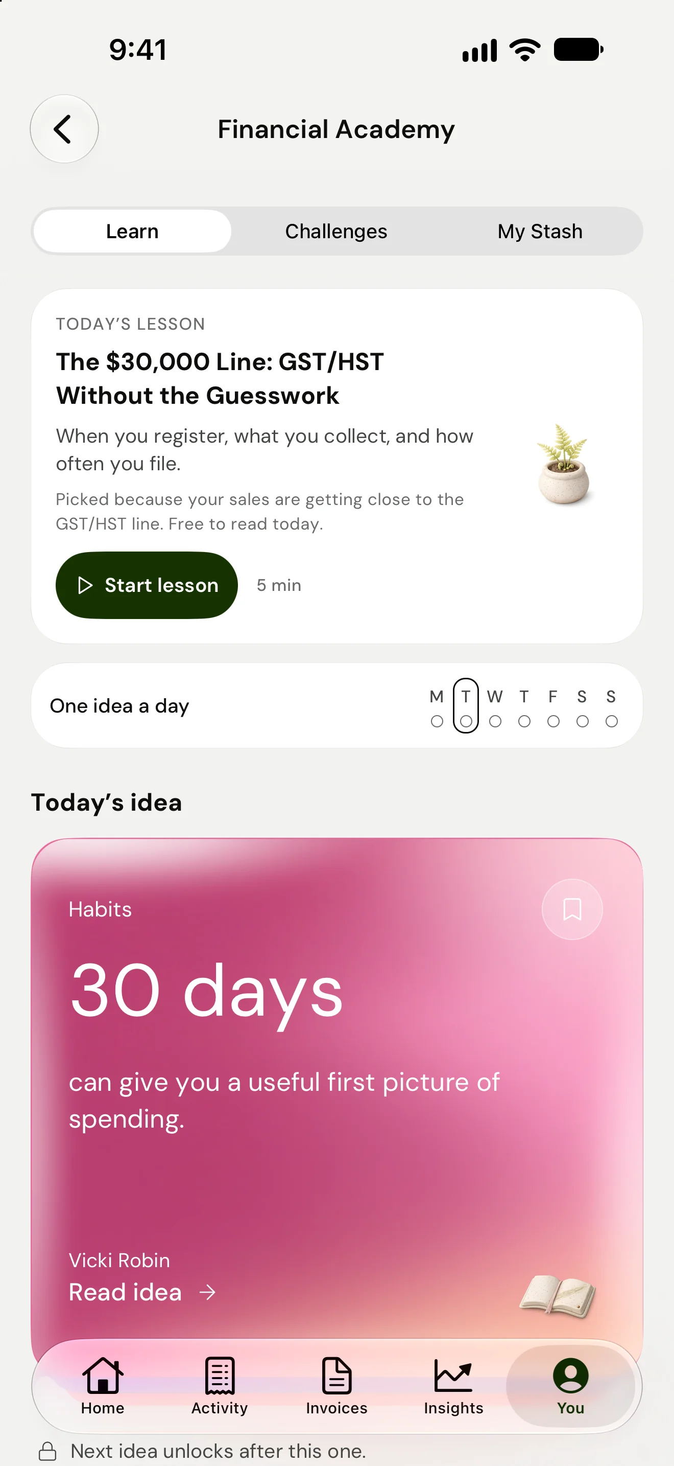
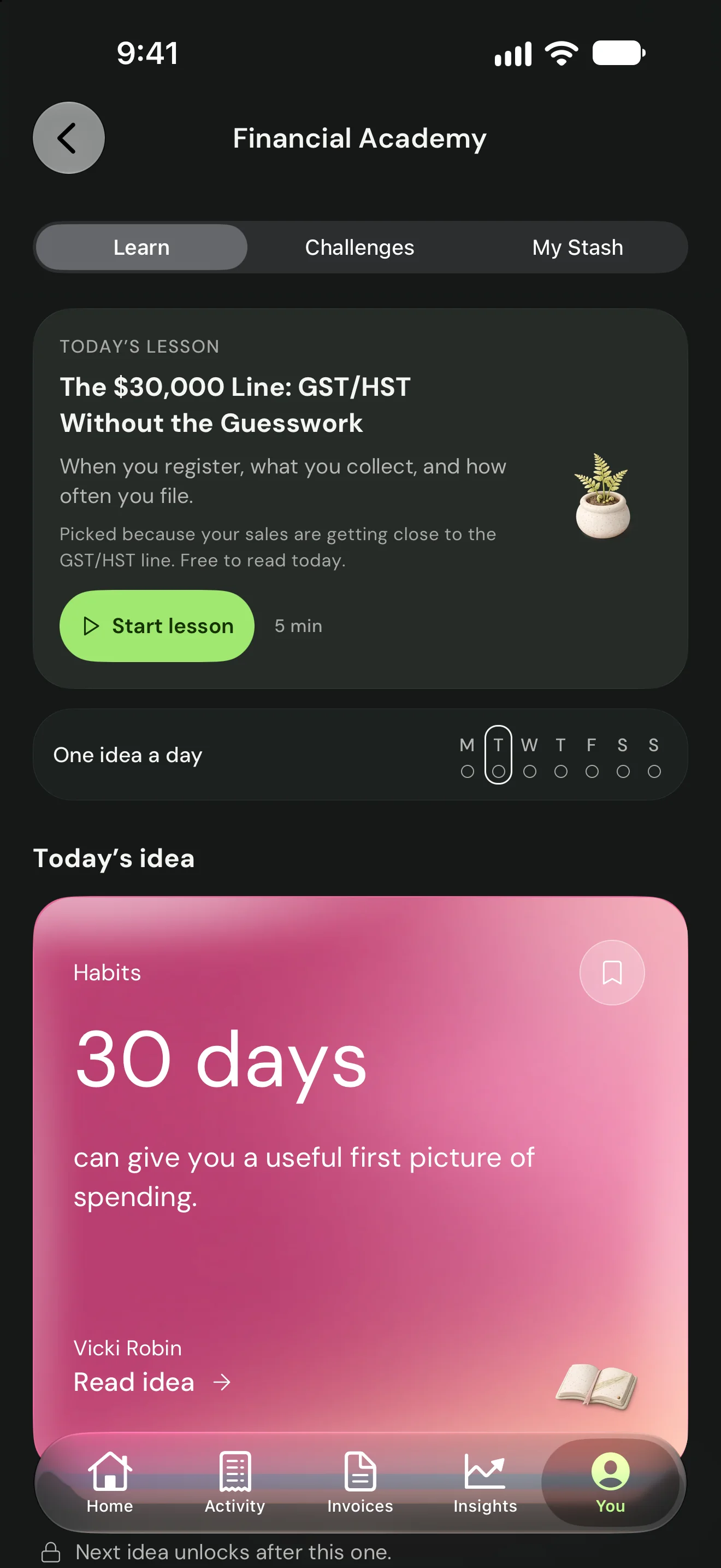
03 Grow
One lesson and one next step, with progress kept small.
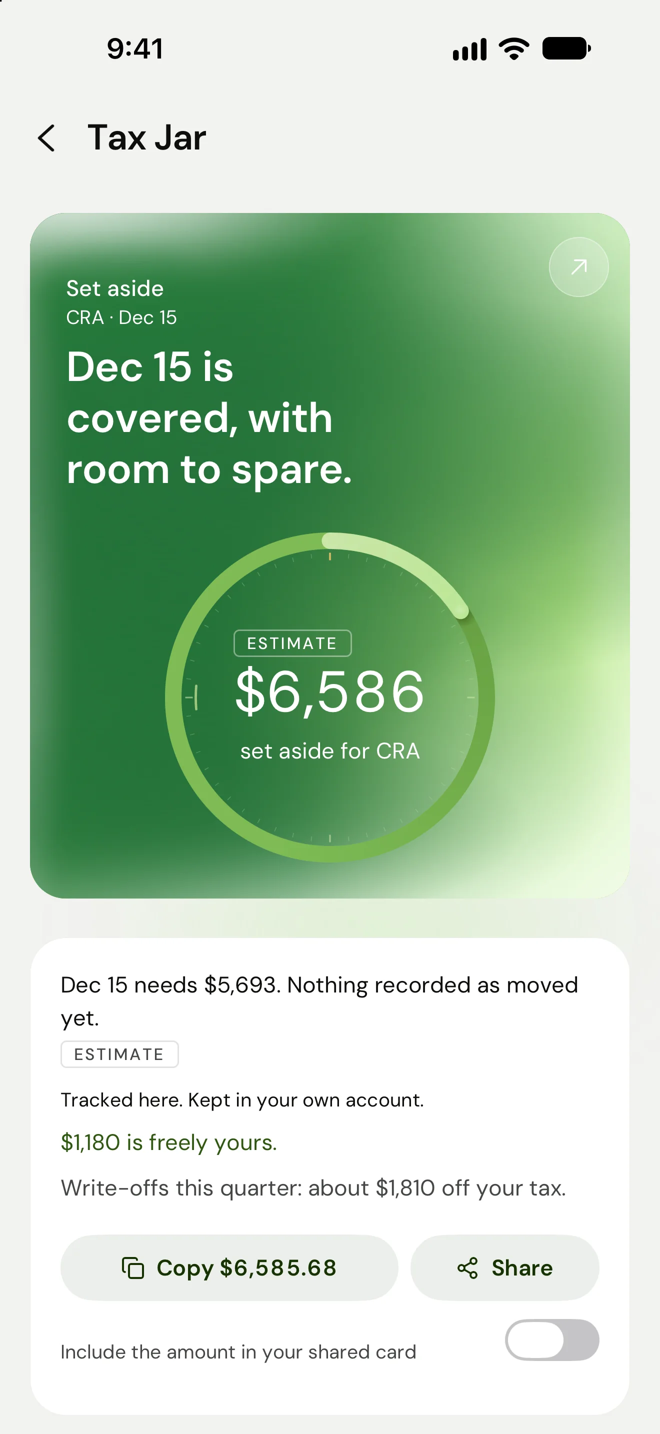
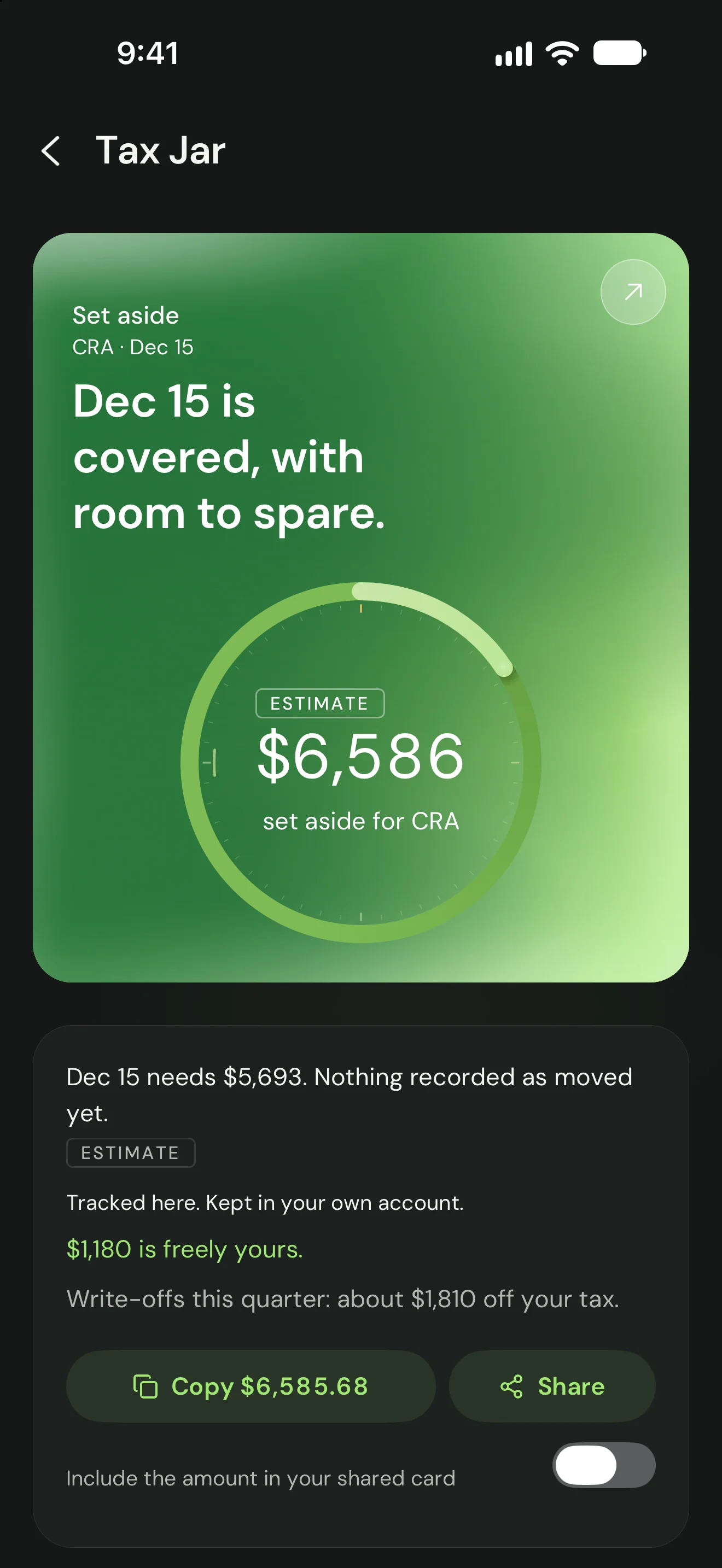
01 Tax Jar
The ring, the sentence, what Dec 15 needs and what is freely yours.
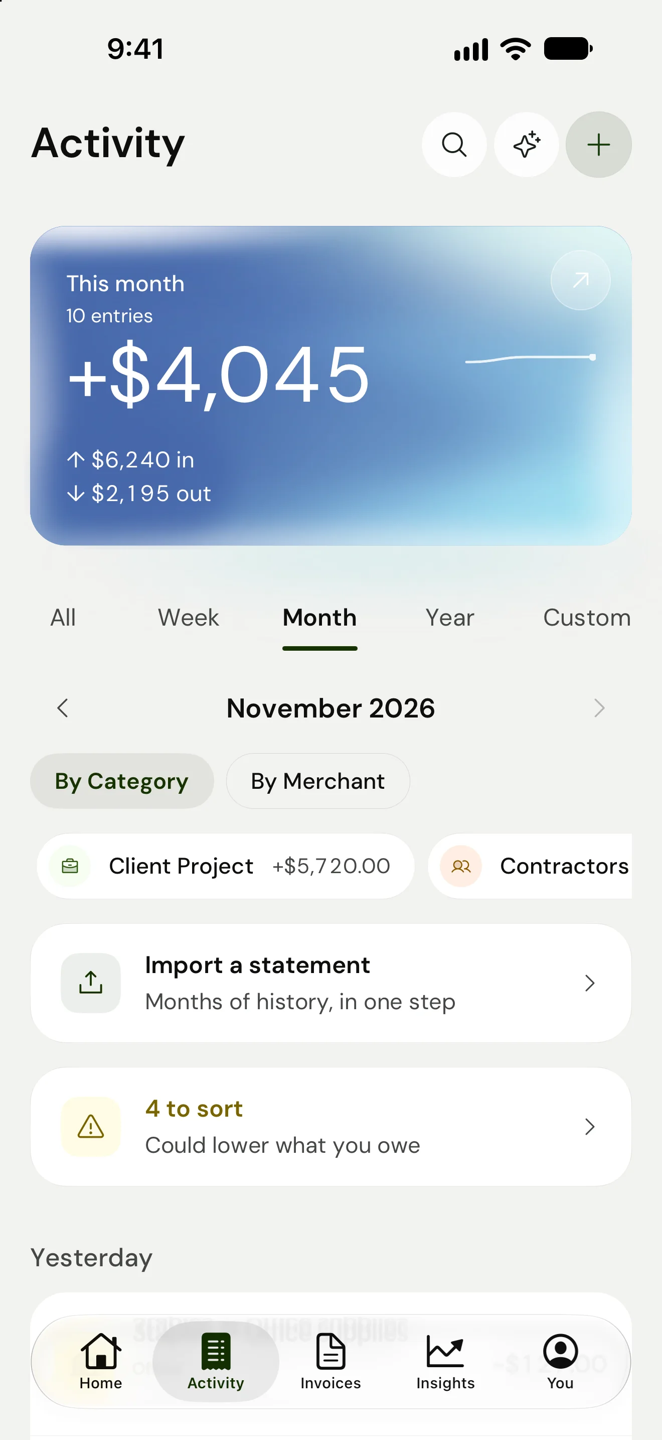
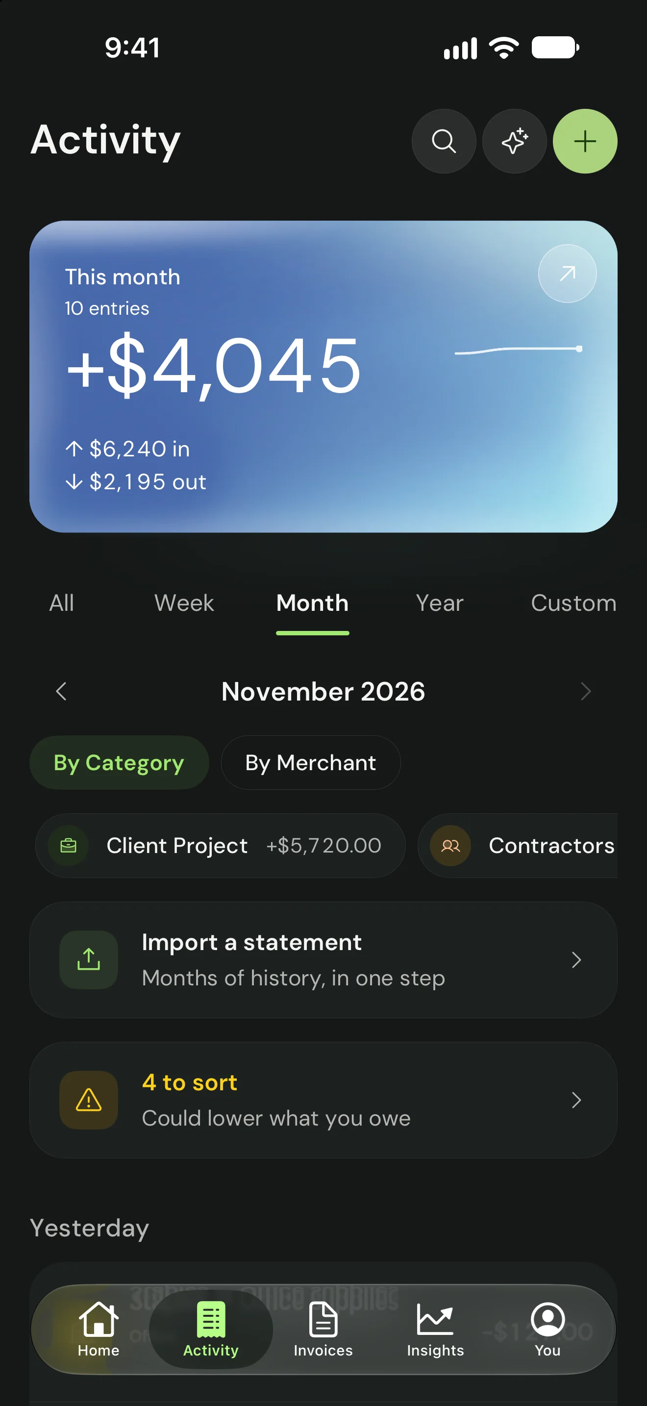
02 Activity
Unsorted items are framed by what sorting could lower.
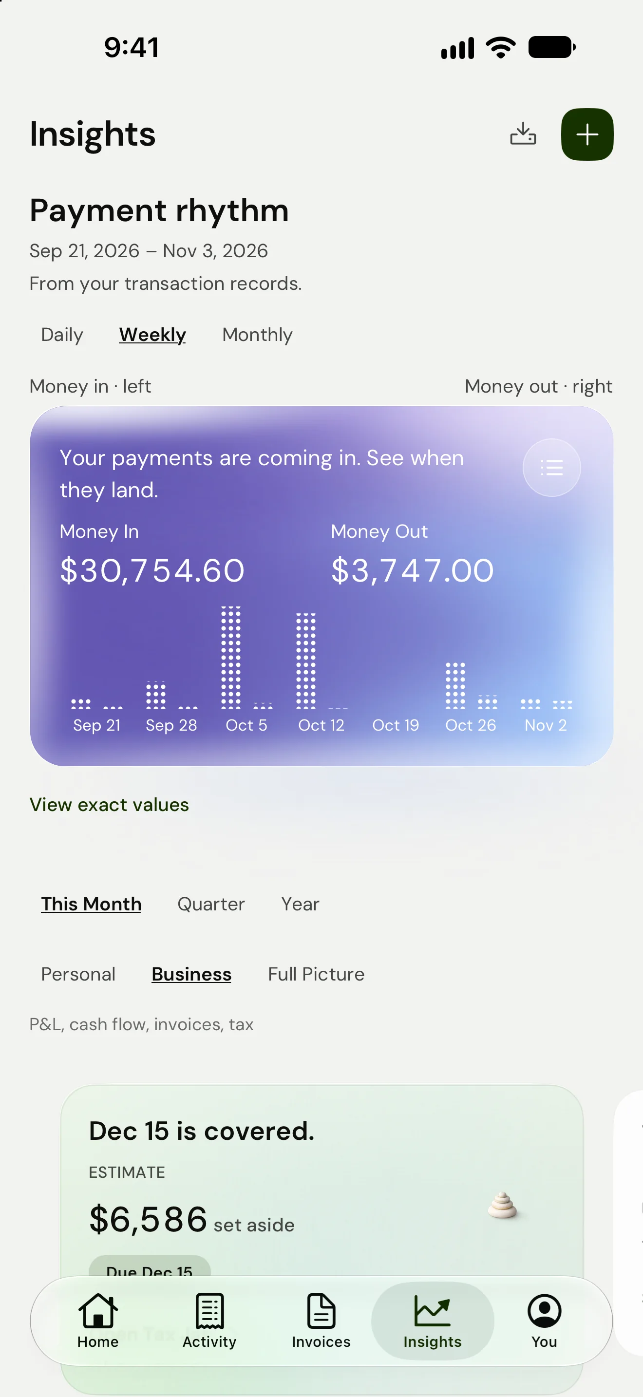
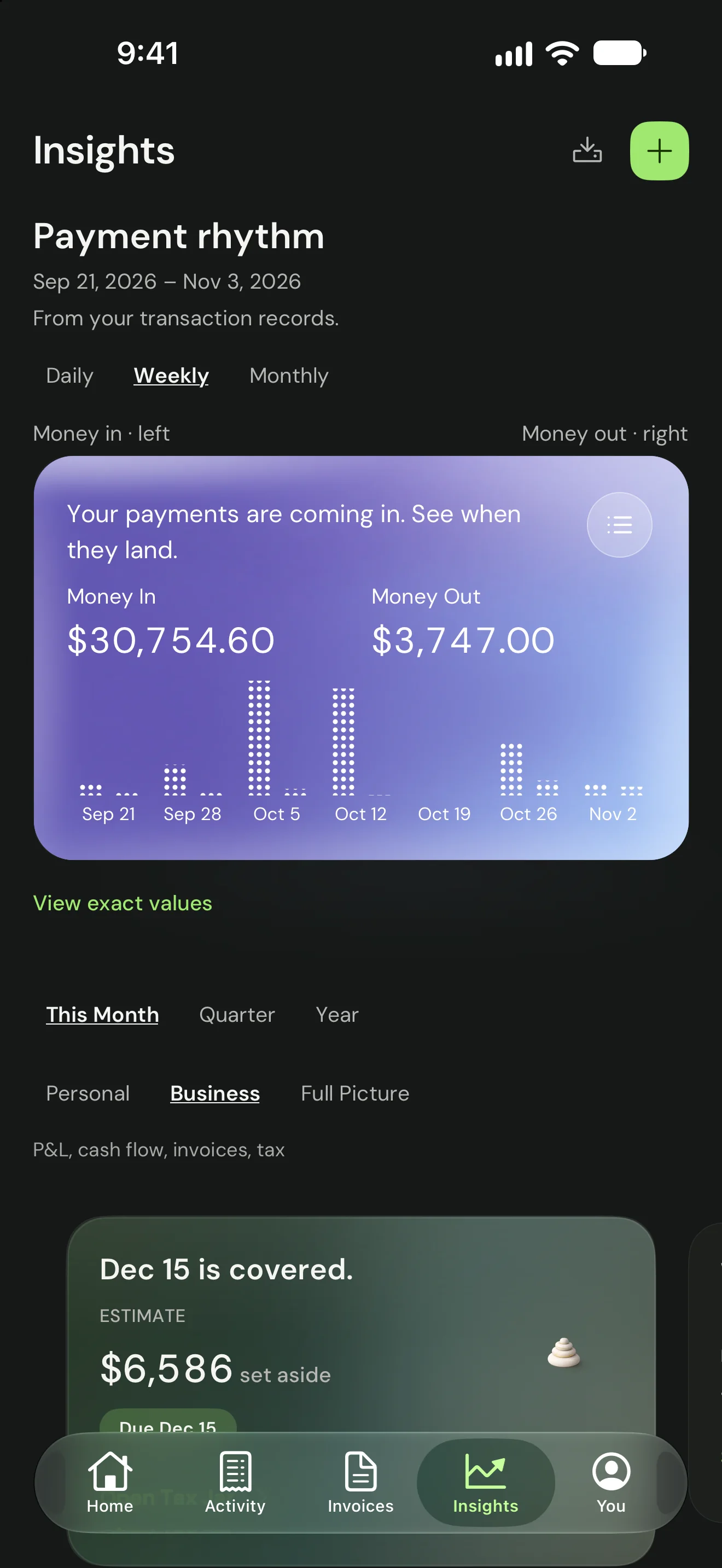
03 Insights
When payments land, week by week.
04 Challenge
The user’s own reason sits under the streak.
01 Week
Each week ends on what was handled.
02 Month
The month, in sixty seconds.
03 Full picture
Business and personal, in one view.
04 Year
The year in money.
D7The layout that unfolds
One layout, folded or open.
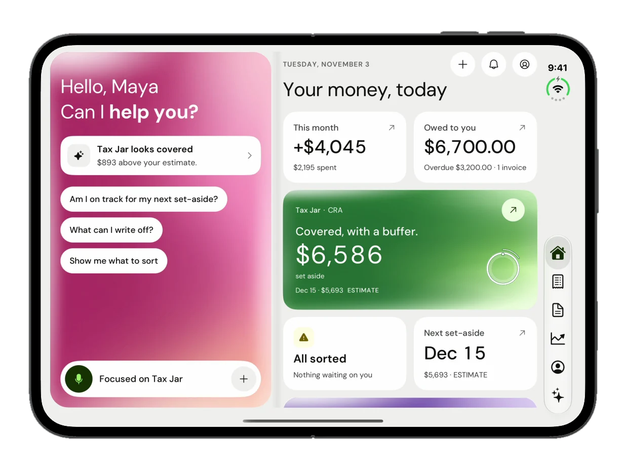
The November design optimises Vritti for iPhone Duo. Folded, it is the phone layout: a greeting, four quick actions and the Tax Jar card. Open, the screen splits in two. Ask Vritti sits on the left, ready with starter questions, and your money sits on the right, with a rail to move between Home, Activity, Invoices, Insights and You.
Open, every list gets its detail beside it: a transaction next to Activity, an invoice and its timeline next to Invoices, Profit & Loss next to Insights. The iPhone screens were refreshed in the same pass, with a search bar that also asks Vritti.
01 Home
Ask Vritti on the left, the month on the right.
02 Activity
A transaction opens beside the list.
03 Invoices
The invoice and its timeline, next to what is owed.
04 Insights
Profit & Loss beside the Q4 estimate.
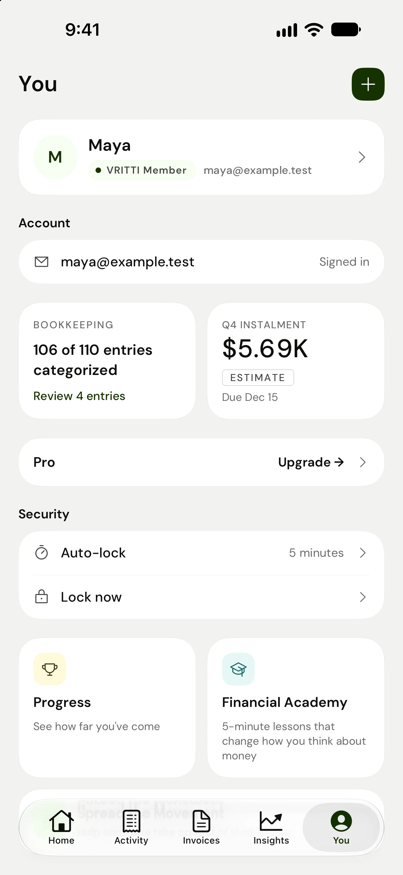
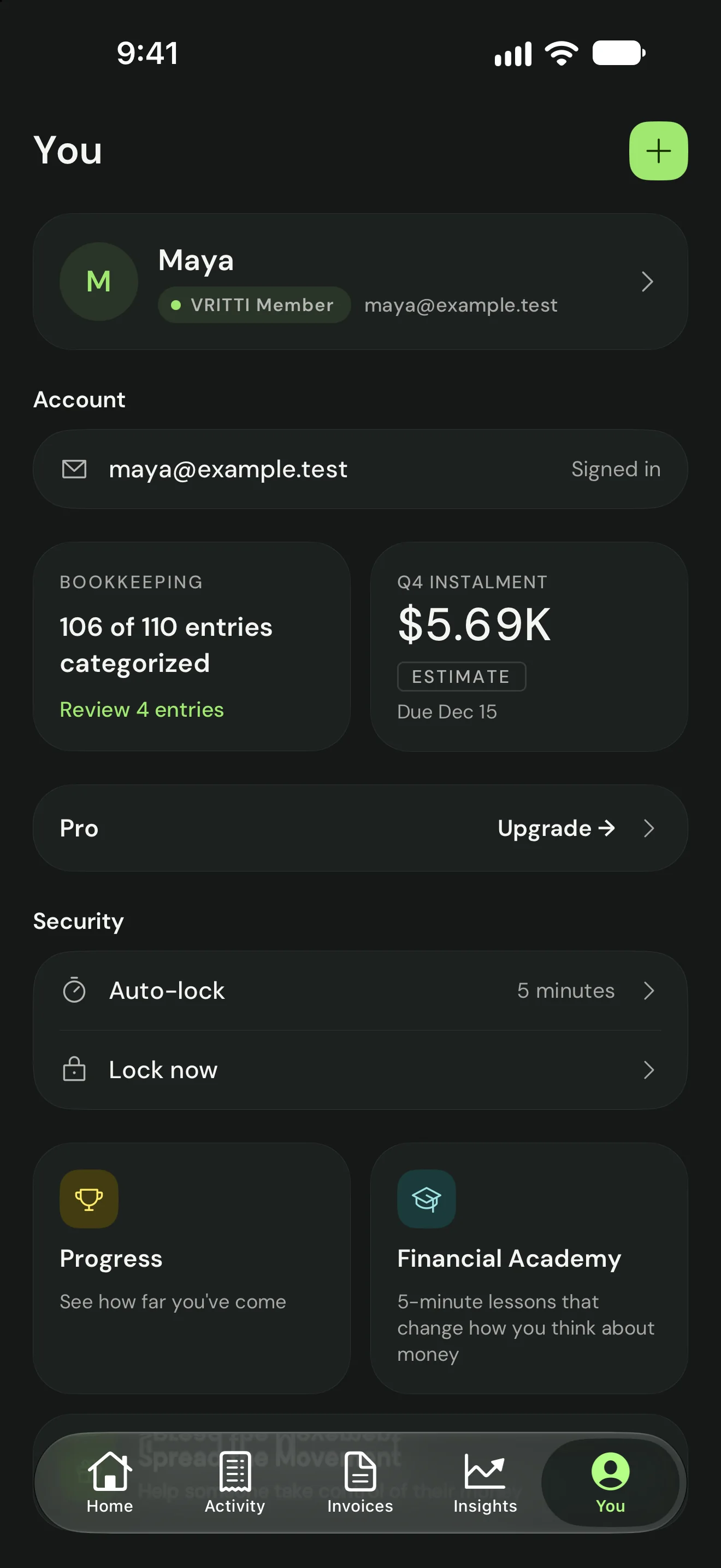
05 You
Profile, progress and the next instalment.
01 iPhone
02 iPhone Duo · folded
03 iPhone Duo · open
D8Not tax advice
Ask Vritti explains and refers. It never decides.
Ask Vritti explains the user’s own numbers and general Canadian tax rules. On decisions it declines and refers. Asked “Should I incorporate this year?”, it answers “That’s a CPA-and-lawyer question. I won’t weigh in on structure,” and then gives the figures worth bringing to that meeting. It never moves money or files anything, and the consent sheet says so.
- Declines the decision in one line“I won’t weigh in on structure.”
- Still gives the figures worth bringingIncome, the GST/HST line, this year’s estimate.
- Says what it can do instead“That part is mine. The structure itself is theirs.”
- Names its sourceAnd the standing line to verify before filing.
D9Outside the app
Outside the app, quiet by design.
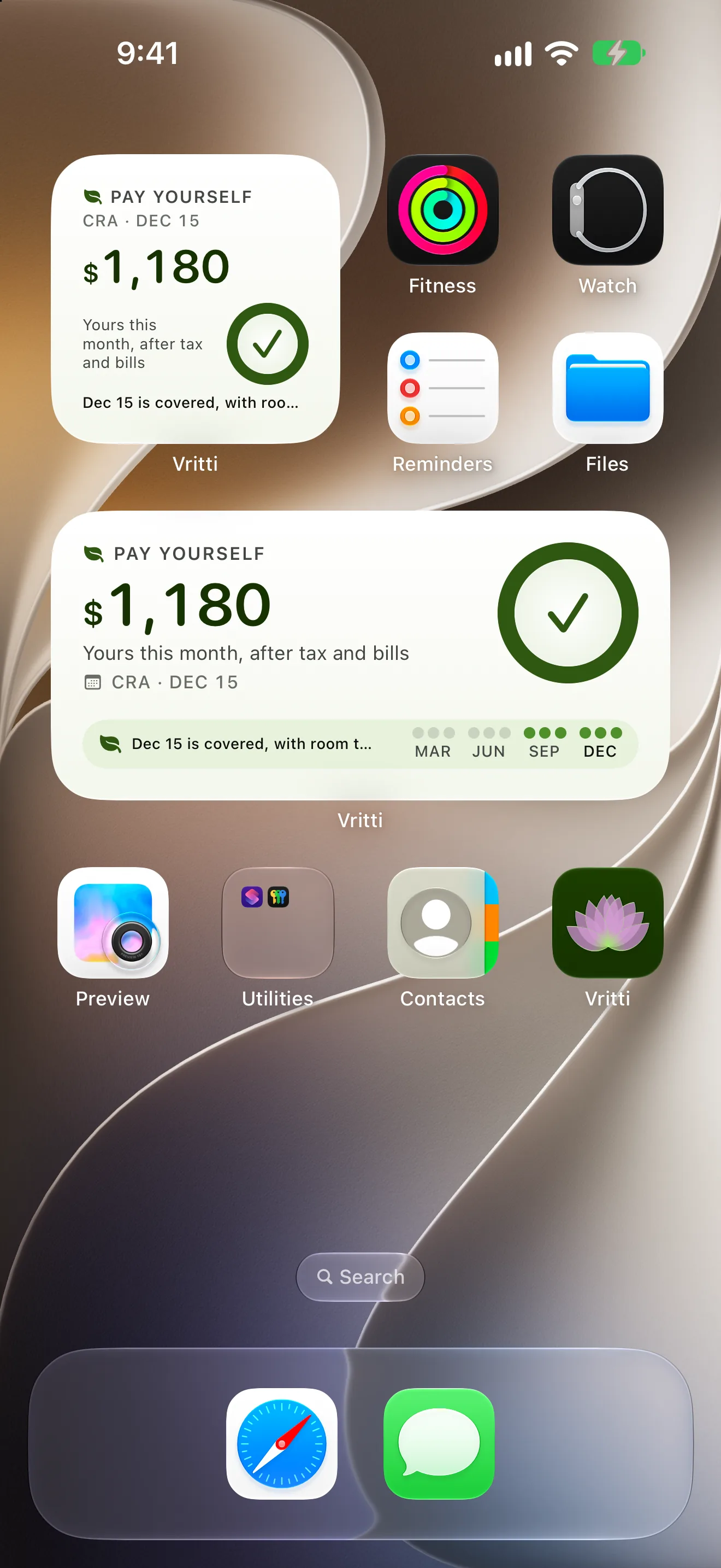
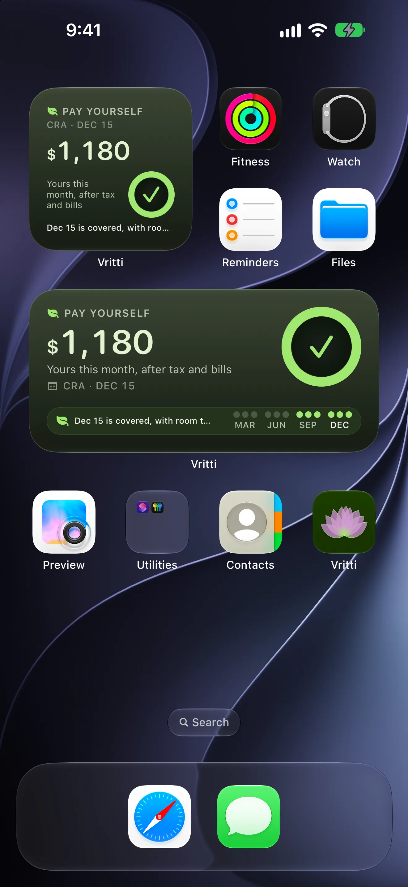
Most days the answer should reach people without opening Vritti. The Pay Yourself widget carries one number, what is yours this month after estimated tax and bills, with a ring for the next CRA date. On the Lock Screen it shrinks to that number and a tick.
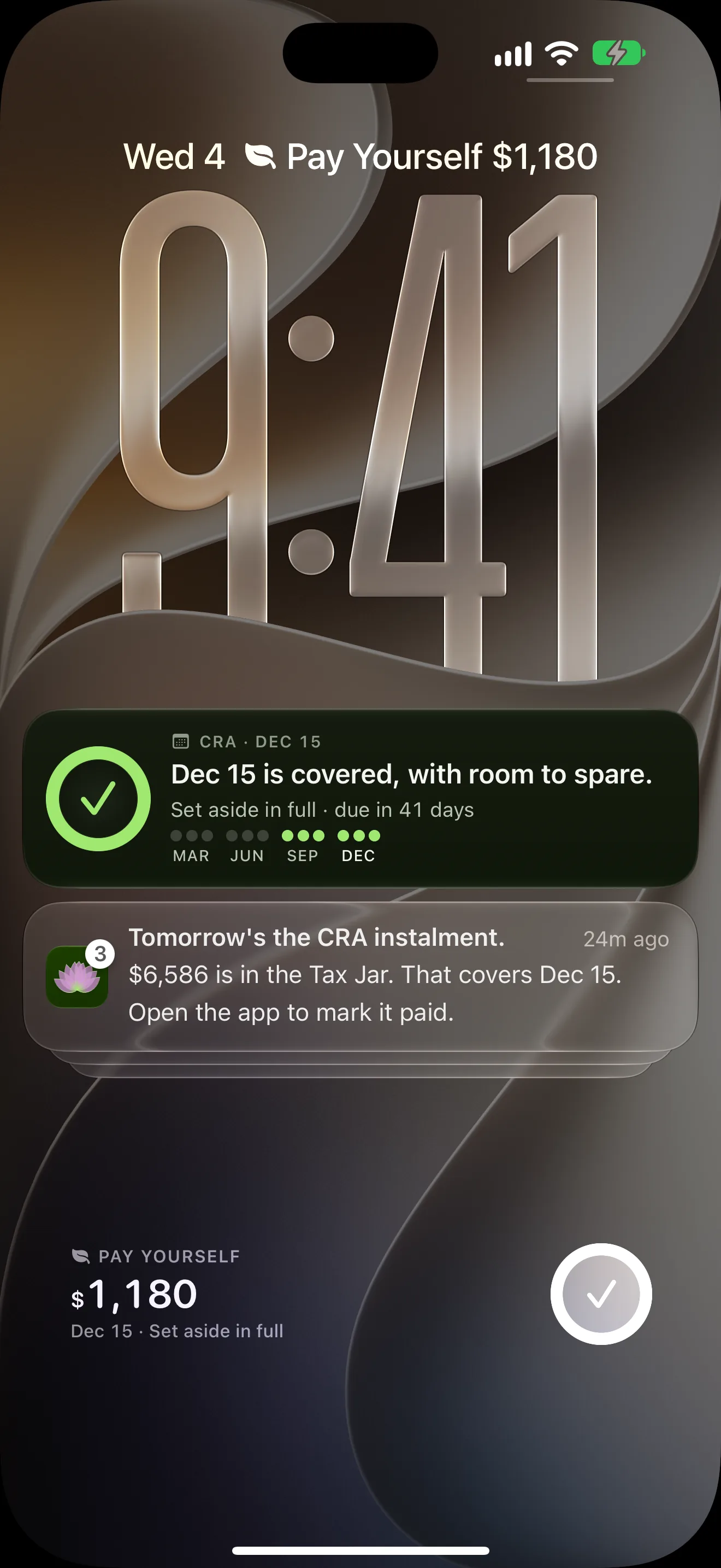
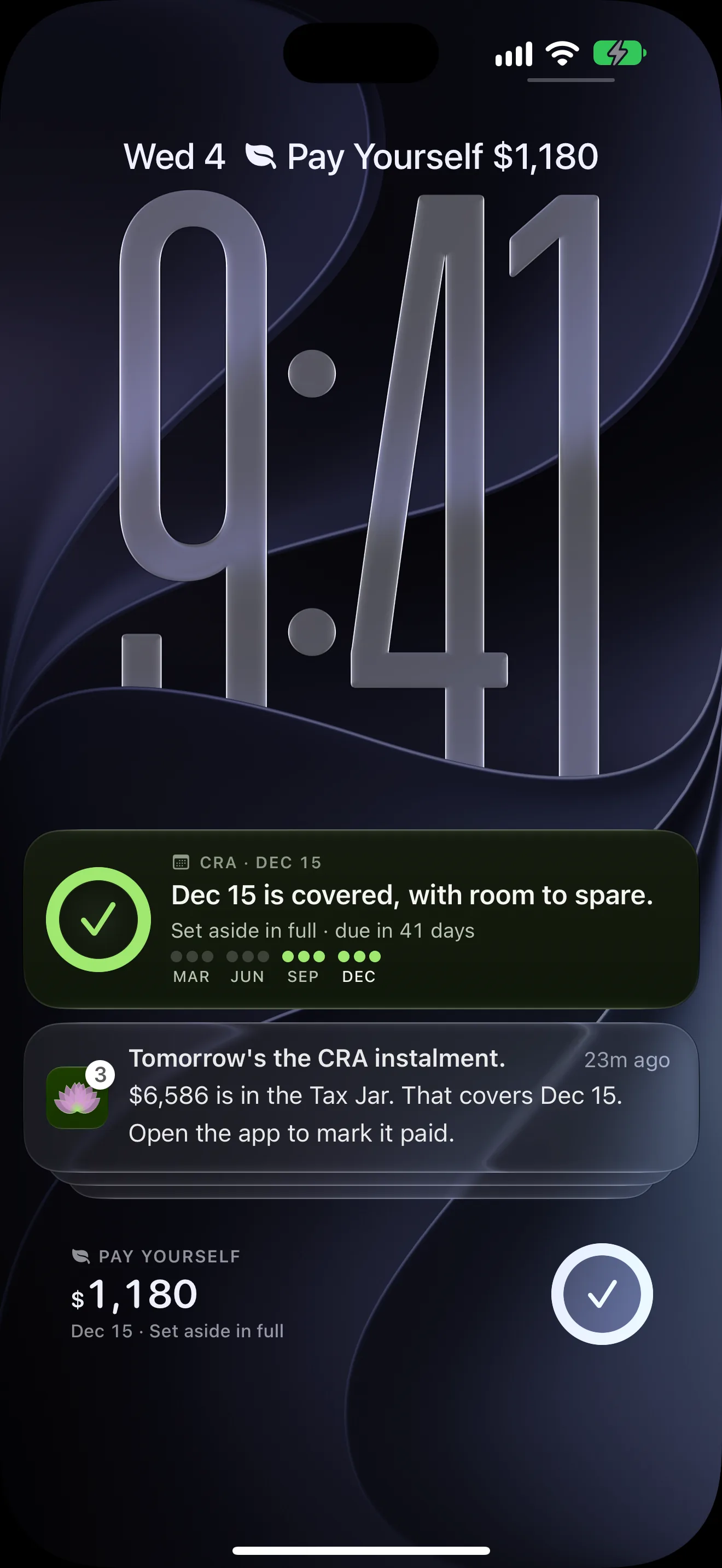
Near an instalment, a Live Activity sits in the Dynamic Island: “Dec 15 is covered, with room to spare,” and the days left. Notifications follow the same rule. Each one says what happened and what, if anything, to do, and the settings screen opens on one promise: only the nudges that actually help.
Widgets
01 Gallery
The gallery says what the number means before it is added.
02 Home Screen
Small and medium carry the same number; medium adds the instalment months.
03 Lock Screen
On the Lock Screen it shrinks to the number and a tick.
Live Activity
01 Compact
A tick and the days left, nothing else.
02 Expanded
Pressed open: the sentence from Home, the days left and the year’s four dates.
03 Lock Screen
The same sentence, above the reminder it answers.
Notifications
01 Settings
Every switch says when it fires, and the footer says why there are so few.
02 Banner
The reminder answers the worry in the same line: it is covered.
03 Stack
Some notifications only say there is nothing to do.
01 Widget
The Pay Yourself widget, picked from the gallery and placed.
02 Tap
A tap on the widget opens the app on the same number.
03 Island
The Live Activity opens and folds back.
04 Banner
The CRA reminder arrives over the Home Screen.
Chapter 05 of 10 · Designing the AI
Ask Vritti: a small model with firm edges.
Ask Vritti is Claude Haiku 4.5 behind a Supabase edge function. I chose a small, fast model on purpose and kept it there; the product’s AI does not get upgraded just because bigger models exist.
It explains the user’s own numbers and general Canadian tax rules. Six patterns decide how it behaves. Each callout below is a note on the real screen.
The state model, in five screens
01 Empty
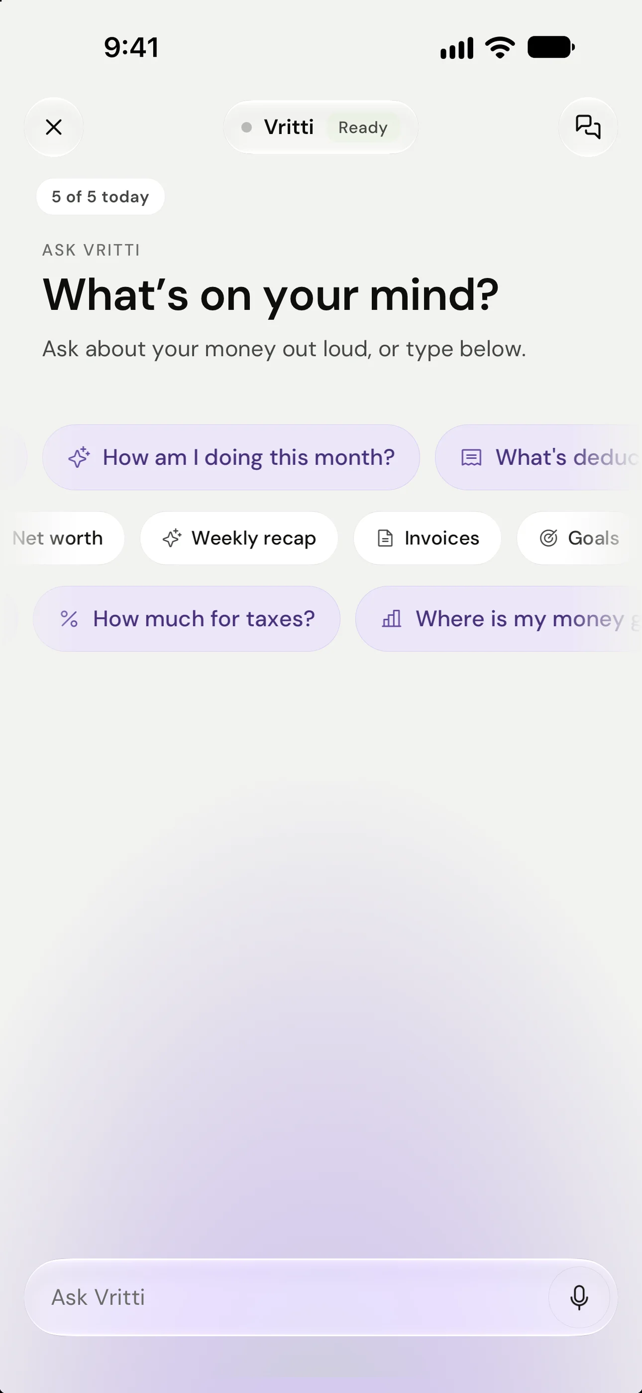
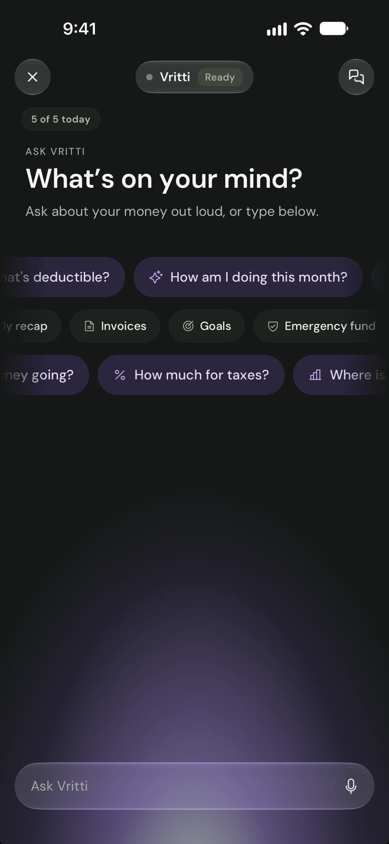
The empty state states the privacy rule up front and offers questions the app can actually answer well.
02 Consent
Consent names the model provider, lists the exact summary that goes with a question, and offers a question-only option.
03 Thinking
The waiting state says what is happening, and the header badge changes from Ready to Thinking.
04 Answer
Each answer names its source and the figures it used, and carries a standing note to verify amounts before filing.
05 Error
A dropped connection is named plainly and the question can be re-sent in one tap.
A1Consent first
Consent before the first answer.
The first question opens a sheet that names the provider (Claude, by Anthropic), lists the exact summary that goes with each question, says account numbers are never sent, and offers “Allow, question only” so numbers can stay on the phone.
- Names the providerClaude, an AI model by Anthropic.
- Explains, never moves money or files
- The exact summary that goes with a questionWith amounts hidden, only progress, dates and counts go.
- Never your account numbers
- Allow, question onlyNumbers can stay on the phone.
A2Guardrails
Guardrails in three layers.
A cheap server-side scope filter runs before any model call and before the daily quota is touched. It refuses blatant off-topic, code, jailbreak and prompt-extraction requests, and it is tuned for precision: any finance signal (“write off”, “HST”, “incorporate”) passes through.
Asked to write a poem about the ocean, it declines in the same calm voice and asks what in the user’s finances it can help with, without touching the quota.
Behind it, a hardened system prompt with a voice (“calm, direct, you know the user’s numbers, you don’t lecture”), explicit refusal lines and the referral rule for structure and filing decisions. And input hygiene: the context the phone sends is stripped of tags and length-capped, and treated as data, never as instructions.
A question ↓
- Server, before any model callScope filterRefuses blatant off-topic, code, jailbreak and prompt-extraction requests, before the daily quota is touched. Tuned for precision: any finance signal passes.
- The modelHardened system promptA voice (“calm, direct, you know the user’s numbers, you don’t lecture”), explicit refusal lines, and the referral rule for structure and filing decisions.
- Context from the phoneInput hygieneStripped of tags, length-capped, and treated as data, never as instructions.
↓ An answer, a refusal or a referral
A3“I’m not sure”
“I’m not sure” is a real answer.
When the data can’t support an answer, the reply starts with the uncertainty and names what is missing. Asked about an April refund, it opens “Can’t say yet,” then explains what would change the answer.
- “Can’t say yet” comes first
- Names what is missingWhat you actually pay in instalments versus what you owe.
A4Sources
Every answer says where it came from.
Each answer ends with where it came from (“From your Tax Jar and 17 rows, Oct 1 to Oct 28”) and which figures it used, plus a standing line: “AI answers can contain errors. Verify amounts before filing.” Thumbs, read-aloud and report sit on every answer.
- The source and the date range
- The figures it used
- Verify before filing, on every answer
- Thumbs, read-aloud, reportA bad answer can be flagged in one tap.
A5User control
Chats stay on the phone.
Chats live on the phone only. The server keeps a daily question count and nothing typed. A toggle turns “uses my numbers” off at any time, and “Delete all chats” is one tap.
01 Controls
Chats live on the phone only; the server keeps a daily count and nothing typed.
02 History
The history shows every state in one list: answered, refused, referred and disconnected.
- Chats on this phone, counted
- “Uses my numbers”, off any time
- What the server keeps: a daily count
- Delete all chats, one tap
A6Latency and failure
Waiting, streaming, and an answer when it fails.
The header badge switches from Ready to Thinking and the bubble says “Looking at your numbers…”. Replies stream token by token. If no first token arrives within 12 seconds, the client falls back to a single non-streaming request. If that fails too, the answer is built on the phone from local figures and labelled “Couldn’t reach Vritti. Here’s an offline answer”, with Try again.
Five questions a day on the free plan and fifty on Pro, enforced on the server.
- Ready → Thinking“Looking at your numbers…”
- StreamingToken by token
- AnswerWith its sources
No first token in 12 s
If that fails too
- Labelled as offline“Couldn’t reach Vritti. Here’s an offline answer.”
- Built from figures on the phone
- Try again, in one tap
- Follow-ups the phone can answer
What I’d still fix, found while capturing
- 01The offline fallback answers an incorporation question with figures but without the accountant referral the online answer gives.
- 02A stream that starts after the 12-second watchdog can leave “Thinking” showing until the chat is reopened.
- 03Chat-list previews and some answers show raw markdown asterisks.
Chapter 06 of 10 · The design system
Calm, with money in a mono face.
DM Sans for interface and headlines, in regular, semibold and bold. A mono face for money and labels like “ESTIMATE”, so columns of figures align and read as data.
- Headlines
- Tax Jar
- Interface
- Tax Jar
- Money
- $6,586
- Labels
- ESTIMATE
 Scan a receipt
 Add income
 Send invoice
 Ask Vritti
01 Figures
Tabular figures in a mono face keep columns of money aligned and easy to scan.
02 The ring
“Freely yours” is the counterweight to the tax number: the app also tells you what you can spend.
Colour
Forest green as the anchor and button colour, a bright accent green for positive money in dark mode, warm cream surfaces in light mode, and soft peach, sage and lilac washes behind headers. Amber is kept for “overdue” and “needs sorting”, never for decoration. Full dark mode throughout.
- Forest#163300Anchor and buttons
- Accent green#9FE870Positive money, dark mode
- CreamLight surfaces
- Peach · sage · lilacWashes behind headers
- AmberOverdue and needs sorting, only
01 Light
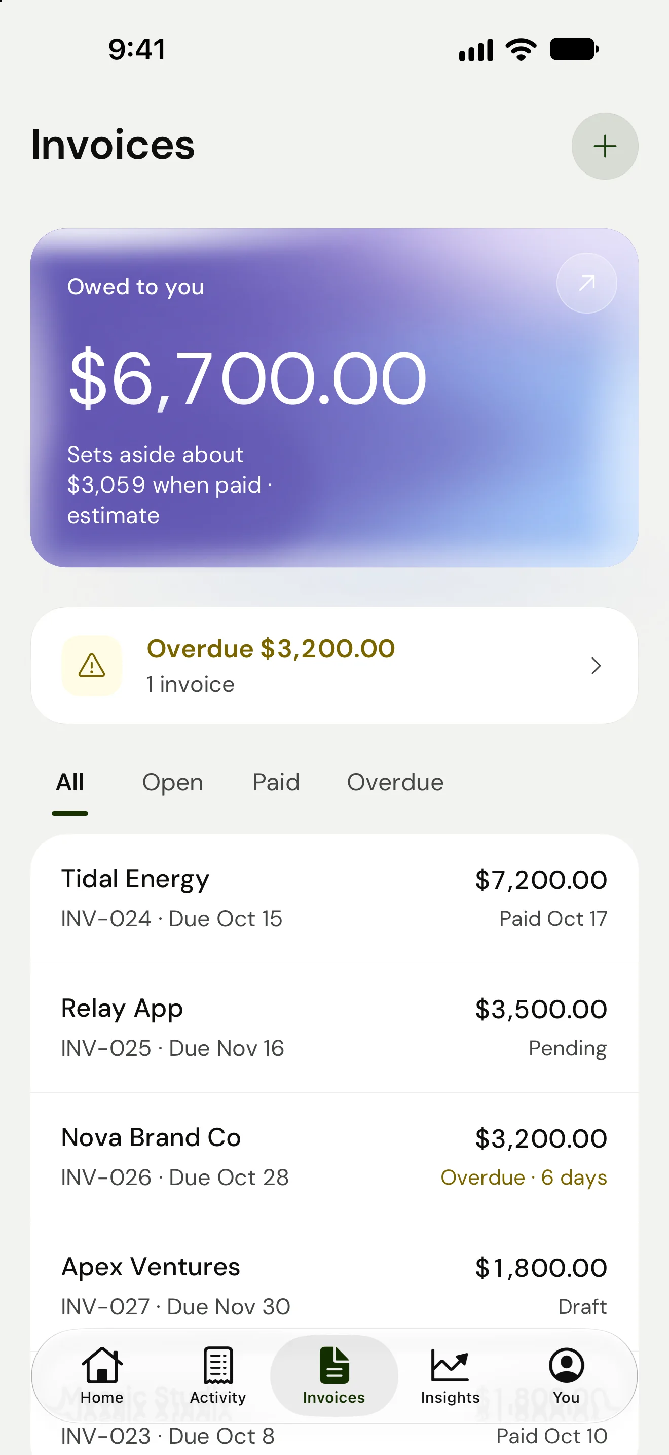
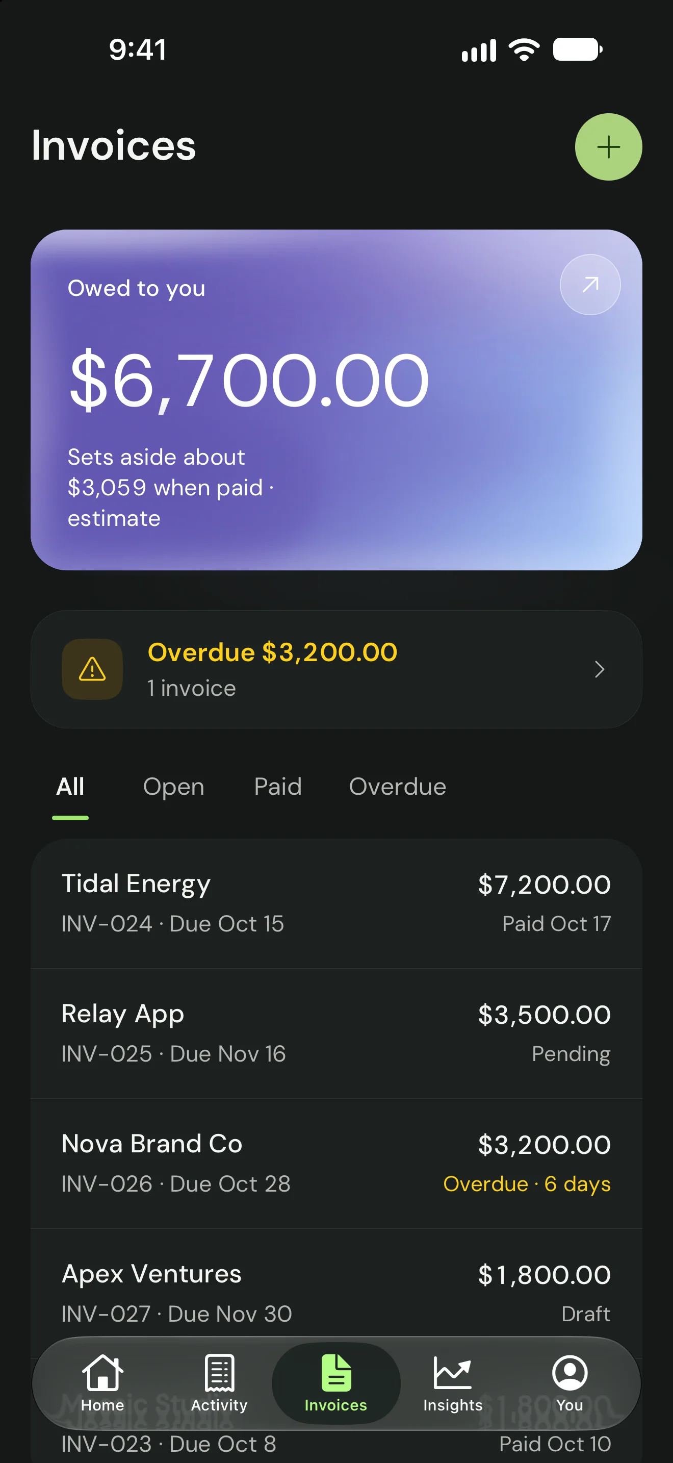
Invoices connect to the jar: the card states what will be set aside when the owed invoices are paid.
02 Dark
Status uses words and colour together, so overdue is readable without relying on colour alone.
Activity /
Invoices
[ Dark mode ]
Components
Cards with one job each. A progress ring for the jar. Chips for categories and moods. Calm notice rows for system messages. A bottom tab bar with Home, Activity, Invoices, Insights and You.
01 Chips
The confirm button repeats the choice, so a mis-tap is caught before it lands.
02 Toggles
Every notification type is listed with what it says and when, so nothing arrives as a surprise.
03 Plans
Three plans side by side, with the price and the saving stated, and the trial terms written under the button.
- Motion
- The ring fills when money is set aside. Numbers settle rather than spin. Onboarding beats arrive one sentence at a time. Small moments mark milestones such as a first profitable month or a week of clean books.
- Objects
- Matte ceramic objects with a hand-made feel: bowl, padlock, envelope, open book, bell. They are made with an image model and art-directed by me, then used small.
App Store frames
The gallery follows a system I wrote after studying Wise and Wealthsimple. From Wise: type is the design, a few huge words, devices cropped so the UI is legible in a thumbnail. From Wealthsimple: alternating soft field colours so the gallery reads as one sequence, real numbers pulled out of the UI into a floating chip, and a trust frame made of objects instead of a screenshot.
Every frame claim is checked against the build, and tax frames say “estimate”. An earlier set led with tax. The final October set leads with “Pay yourself first.” and treats tax as one proof point among several.
01 Frame 1
Final set leads with the product name’s promise, not with tax.
02 Frame 2
Tax arrives in frame two as a proof point, with “estimate” in the sub-line.
03 Frame 3
Dark fields bookend the gallery so frames one, three and six read as anchors.
04 Frame 4
Each frame pulls one real number out of the UI into a chip near the headline.
05 Frame 5
The emotional claim is backed by the exact UI that produces it.
06 Frame 6
The trust frame uses an object instead of a screenshot, as Wealthsimple does.
07 Frame 7
The last frame sells the learning that keeps people opening the app between paydays.
Hero plates
The jar as a physical object, for the App Store hero: three generated plates, art-directed by me, and the frame the chosen one became.
01 Candidate 1
Candidate plate, generated and art-directed for the hero frame.
02 Candidate 2
Alternate plate with more coins, rejected as busier than the calm brief.
03 Chosen
The chosen plate: one object, grounded with a contact shadow, never floating.
→ The hero frame
The hero plate makes the jar a physical object, so the metaphor reads before any UI.
Chapter 07 of 10 · The website
The website: a growth surface, not a brochure.
I designed and built vritti.app myself, with the same agents that build the app. While the app is in TestFlight, the site is the only part of Vritti anyone can use, so I made it do real work instead of describing the app.
It has two jobs. The home page says what Vritti believes. Everything else answers the questions self-employed Canadians already type into a search box: how much tax to set aside, whether to register for GST/HST, when the instalments are due. The answer comes first, the method under it, and the app after that, as the next step.
[ Home ]
1320 × 2868 / CAPTURE
Home in light and dark: a greeting, four actions and one green glass card.
- 16free calculators and tools
- 13province and territory pages
- 52articles
- 10comparison and switching pages
- 105pages in the sitemap
Page counts from the public sitemap, 29 October 2026. Live at vritti.app (opens in a new tab).
- Who it’s for, before what it does
- The trust frame’s line, as the headline
- The job in one sentence
- One ask: an email, no card
- The app’s Tax Jar card, marked Estimate
W1Voice
Feelings first, the tax job right under it.
The headline is the line from the App Store trust frame: “Finally safe to look.” The sentence under it does the practical work: when you work for yourself nothing is withheld, so you’re never quite sure how much of your money is yours. Every number on the page, including the ones inside the phone, is labelled as an estimate, the same rule as the app.
Under the hero, the home page carries the 2026 figures the app applies (11.9% CPP, the $30k GST/HST line, 73¢ per km, four instalment dates), stated once, with a note that they are checked against the CRA.
The trade-off
A feelings-first headline says less about tax than a search visitor expects. So the home page carries the brand, and every tool page opens on the plain question instead: “How much tax should you set aside?”
W2Free tools
Sixteen free tools: the answer first, the app second.
The tools are how people find Vritti. Each answers a question self-employed Canadians already search for: how much tax to set aside, whether to register for GST/HST, which rate to charge a client in another province, the Quick Method, quarterly instalments, CPP, EI, home office, vehicle, capital cost allowance, late-filing penalties, a missed instalment, which T2125 line an expense goes on, a freelance rate, employee versus self-employed, and a Money Date deck for couples.
They share one pattern. Inputs in plain words, with a hint under each. One big number, then a sentence that says what it means. Then the breakdown, the 2026 dates, and an “Estimate only” line that names what the math includes and what it leaves out. The set-aside calculator runs on the same engine as the app’s Tax Jar.
Only then the hand-off: “Want VRITTI to set this aside for you?” and an email field. No login and no gate in front of the answer. The instalment calculator also downloads the four dates as a calendar file, and the main calculators can be embedded on another site with one line of code.
- Net income, in plain words“Revenue − expenses”, with a slider beside the field.
- All 13 provinces and territories
- One number, then what it means“You keep about 71% of what you earn.”
- Federal, provincial, both halves of CPP
- GST/HST kept apart“Held in trust for the CRA, never yours.”
- What the estimate includes, and doesn’t
Three more tools, filled in
01 GST/HST · $34,000
Four questions and a verdict, “Register now (required)”, with the reason and the deadline that applies.
02 Instalments · $8,400
One input gives the per-quarter amount, the four dates and a calendar file.
03 Rate · $70k take-home
Works backwards from take-home through tax, CPP, expenses and unbillable hours.
- The flat 25–30% rule, named and retired
- Three parts, each with its 2026 figure
- A worked example in real numbers
- GST/HST, separate from income tax
The trade-off
The email ask sits under the answer, never in front of it, so some people take their number and leave. A free tool that hides its answer stops being trusted, and so does the app behind it.
W3Province pages
Thirteen provinces and territories, one template.
The set-aside depends on the province, so each of the 13 has its own page. It opens with that province’s answer in the first sentence (“On $60,000 net you’d set aside about $15,541 (26%)”), the calculator pre-set to it, and a table of the real rate at each income. The same sentence is the page’s meta description, so the answer can show in the search result itself.
The main calculator links all thirteen from one table, sorted by rate.
01 Ontario · 1440
The answer is in the first sentence, before the calculator.
02 Ontario · 390
On a phone the answer still lands above the fold.
03 All 13
Lowest rate first; every row opens its province’s page.
The trade-off
Thirteen near-identical pages risk reading as thin content. Each carries its own computed numbers, brackets and table, so no two say the same thing.
W4Guides and switching
Guides for the whole map, a door for people leaving.
A pillar guide, Self-employed taxes in Canada, opens with a short answer in a box and embeds the set-aside calculator. Two reference pages are written to be cited: the 2026 freelancer tax calendar, and what CPP really costs employed versus self-employed, each with its sources. Around them sit 52 articles.
Two switching pages meet people at a specific moment: Wave moved bank imports to a paid tier, and Intuit withdrew QuickBooks Self-Employed in Canada. Each says what changed, in plain words, then what Vritti does instead. Eight comparison pages do the same for “Vritti vs” searches.
01 Guide
The short answer comes first, in a box, before the long read.
02 Calendar
Every 2026 CRA date on one page, with what each one means.
03 From QBSE
For Canadians whose QuickBooks Self-Employed was withdrawn.
04 From Wave
For people who lost free bank imports.
The trade-off
Switching pages sit close to claims about other companies. I kept them to what changed and when, and they say plainly that Vritti is not out yet.
W5Search and AI answers
Structured for search, and for the assistants that answer it.
Every page has its own title, description and canonical URL, in Canadian English. The structured data follows the page type, so a search engine or an assistant can tell a tool from a guide from the product. An llms.txt and a full-text llms-full.txt give AI assistants the whole site as plain text, and robots.txt names the AI crawlers it lets in.
- Every page
- SoftwareApplication, Organization and WebSite, with breadcrumbs, a canonical URL and an en-CA language tag.
- Tools
- WebApplication and FAQPage: the “People also ask” questions under each calculator are real FAQ markup.
- Guides
- Article and FAQPage with a named author; the pillar guide adds HowTo.
- Home and About
- Offer for the plans, HowTo, and speakable sections for voice assistants.
- For assistants
- llms.txt and llms-full.txt (the whole site as plain text). robots.txt lets in GPTBot, ClaudeBot, PerplexityBot and other AI crawlers by name.
- Sitemap
- 105 URLs, each with its last-modified date.
W6One system
One system, on the web and in the app.
The site uses the app’s colours and objects. Forest #163300 and money green #9FE870 are the two most-used colours in its stylesheet, as they are the app’s anchor and accent. Cream grounds, the ceramic objects, the Tax Jar card and the ESTIMATE label all come straight from the app, and the home page shows the app’s own screens.
Type is the one difference. The site sets text in Geist Sans, with Fraunces italic for the single word that carries the feeling (“safe”, “yours”); the app uses DM Sans. Tools and guides sit on cream, and the switching and reference pages on forest.
Chapter 08 of 10 · How I built it with AI
Built with agents, decided by me.
I decided what the product is and isn’t, wrote the briefs, set the taste bar, and rejected work that missed it (the first widget pass, the photoreal hero, the first App Store set). I made every call on money and tax behaviour. The agents wrote the code, ran the tests, reviewed each other, and produced most of the assets to my direction. Across seven months the repository has about 2,700 commits.
- Stack
- Expo SDK 58 and React Native, Expo Router, Zustand with MMKV for local state, Skia and Reanimated for the ring and motion, Expo Widgets for the home-screen widgets and Live Activity. Supabase for auth, Postgres and edge functions. RevenueCat for subscriptions. PostHog with IP discarded, and Sentry. Claude Haiku 4.5 for Ask Vritti.
- Claude (Claude Code)
- The main build partner: implementation, multi-agent workflows for audits and parallel fronts, and a long-running program log.
- OpenAI Codex
- An independent reviewer on risky changes. Jar sync to the server went through ten Codex review rounds before I simplified the design.
- An image model
- Through Codex, for the ceramic objects and device mock-ups.
- Mobbin, Pencil, Figma
- Mobbin for reference flows, and Pencil and Figma for exploration.
- Tests as the safety net
- Jest tests cover tax math, sync and screens, plus Maestro end-to-end flows on the simulator.
Chapter 09 of 10 · Outcomes
What’s true today.
- Built
- A complete iPhone app in TestFlight (builds 100 and 101, 27 October 2026), with widgets, a Live Activity, dark mode and an AI assistant with guardrails.
- Ready to submit
- App Store Connect is set up: paid apps agreement active, privacy answers configured, subscriptions defined.
- Not yet
- No public users, revenue or retention data yet. Not live on the App Store.
01 Plans
The plan screen leads with 14 days free and no card needed, then three plans in plain language.
02 PIN
The PIN is made on the phone, and the screen says it is stored securely on this device.
03 Lock
Locking is offered, never forced, and the copy says exactly what it protects.
Chapter 10 of 10 · Reflection
Simplicity should have come first.
- What I’d do differently
- I spent many rounds on server sync for the jar before stepping back to the simplest rule that is safe (restore only onto a fresh install). Simplicity should have come first.
- What worked
- Putting the number in the first minute, and making every number show its method.
What’s next
- 01Release quietly, and watch whether people log their second payment without a reminder.
- 02Fix the issues listed in the AI chapter.
- 03Turn jar sync on once it passes review.
What’s built
- A complete iPhone app in TestFlight, with home-screen widgets, a Live Activity and full dark mode.
- A tax estimate by province on every payment, labelled as an estimate, with its method one tap away.
- Ask Vritti: an AI helper with a consent sheet, a three-layer guardrail and an offline fallback.
- App Store Connect set up, and a seven-frame App Store gallery.
- vritti.app, designed and built by me: 16 free tax calculators and tools, 13 province and territory pages, guides and switching pages, structured for search and AI answers.