Essay 03 · Design practice
Redline beforeyou redesign.
Most sites that “need a redesign” need a red pen first. Why I start with one — and tried it on my own site first.
Before I redesign anything, I redline it: one person marks up the homepage at phone width — what to cut, what to add, and why. It is how my consulting work under UXPro starts, and it is the most valuable design habit I have.
01
Why not just redesign?
A redesign feels decisive. It is also the most expensive way to find out what was wrong. You throw away the parts that worked with the parts that didn’t: the page that ranks, the address people bookmarked, the sentence customers repeat back on the phone. And you end up arguing about taste, because nobody wrote the problem down.
A redline makes you write it down. Every mark has to say what is wrong and why it matters to the person on the other end.
It is also honest about scope. Some marks are a sentence to rewrite, some are a page to cut, and a few say the structure itself is wrong. Everyone sees which is which before any budget moves — and if a redesign is needed, that conversation gets much shorter.
“Feels dated” doesn’t survive a redline. “Your phone number is three screens down” does.
02
Phone width, on purpose
I mark up at phone width first because that is where a small-business site is hardest to get right: headlines that wrap into five lines, the one button people need sitting below a carousel, menus that hide the thing they came for. If a page works at 390 pixels, the desktop version is usually a matter of room.
03
I redlined my own site first
Before rebuilding uxpro.ca, I audited it the way I would audit any production site. The Framer template scored 48 for mobile performance, with 13.8 seconds to the largest paint. The headline sat behind an animation, so a crawler often saw no headline at all. Its case studies showed up in search titled “Newsbook – Framer Template”, and every blog post was dated 25 July 2023.
That redline became the brief. This time it said: rebuild — the template couldn’t be fixed from the inside. But I knew exactly what the new site had to do better, and I could check it afterwards. The new home page reads 97 for mobile performance and 2.3 seconds to the largest paint.
04
A good method makes a bad identity
I liked the Redline so much that my first homepage drafts led with it: “We redline websites.” It tested well as a line and it was wrong as an identity. Read cold at phone width, it sounded like the only thing on offer.
I rewrote the first screen to say the whole scope in one sentence, and moved the Redline to where it belongs: a first step. I keep relearning this. The thing that makes you different is rarely the thing a person came for. Lead with what they came for, and let the method be how they start.
05
Publish your own red marks
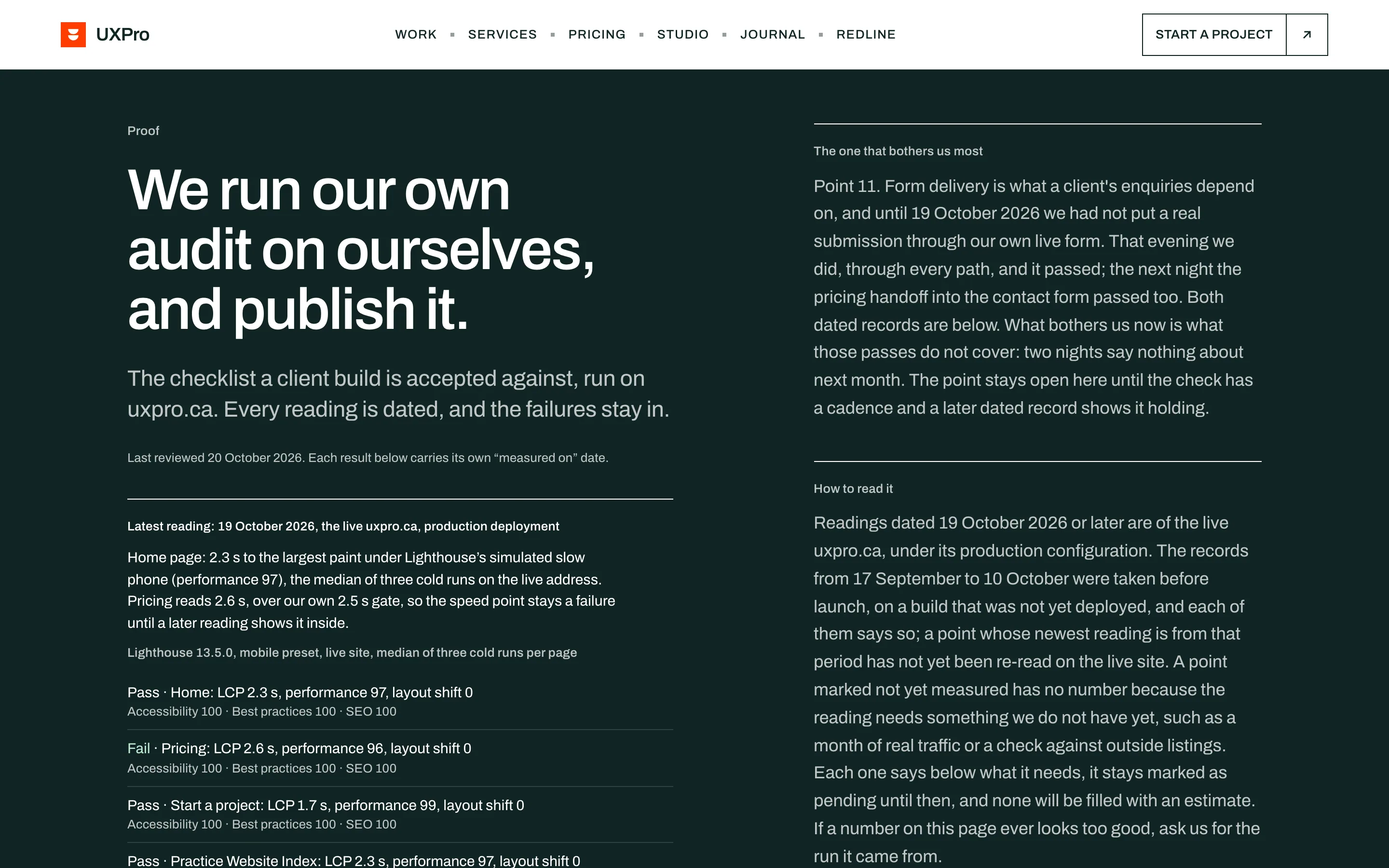
The habit carried into the site itself. Its proof page runs the same checklist on uxpro.ca and publishes the readings with dates — including the fails. The quote page reads 2.6 seconds to its largest paint against the site’s own 2.5-second gate, so it is marked as a fail until a later reading says otherwise.
It would be easy to delete that row. Keeping it is the point. A redline only works if you are willing to be marked up.
06
How to run one
- Open the page on a phone, as a stranger, with one question: what did this person come here to do?
- Mark only what you can explain. Every mark gets a reason the page’s owner would agree with.
- Sort the marks into cut, add and move. Most pages need more cutting than adding.
- Keep what works — the pages that rank, the addresses people use, the words customers say.
- Decide on a redesign last, and only if the marks say the structure can’t hold.
— ParthKitchener–Waterloo · 28 Oct 2026